WELCOME_
WELCOME_
WELCOME_
WELCOME_
WELCOME_
WELCOME_
WELCOME_
WELCOME_
WELCOME_
WELCOME_
WELCOME_
WELCOME_
WELCOME_
WELCOME_
WELCOME_
WELCOME_
WELCOME_
WELCOME_
WELCOME_
WELCOME_
WELCOME_
WELCOME_
WELCOME_
WELCOME_
WELCOME_
WELCOME_
WELCOME_
WELCOME_
WELCOME_
WELCOME_
WELCOME_
WELCOME_
WELCOME_
WELCOME_
WELCOME_
WELCOME_
WELCOME_
WELCOME_
WELCOME_
WELCOME_
WELCOME_
WELCOME_
WELCOME_
WELCOME_
WELCOME_
THIS IS MY CREATIVE SAFESPACE
CURRENTLY UI/UX
▼ learn_more_


ABOUT_

LEONARD BETZ
I am a creative mind
Front-End Development
Graphic Design
Illustration
I craft visually appealing
and efficient digital experiences
through research and prototyping.
▼ check_out_my_work_
It's all about the details.
Fun is important.
Let's make the difference!
▼ contact_me_
WORK_
Jurassic Hive
Overview

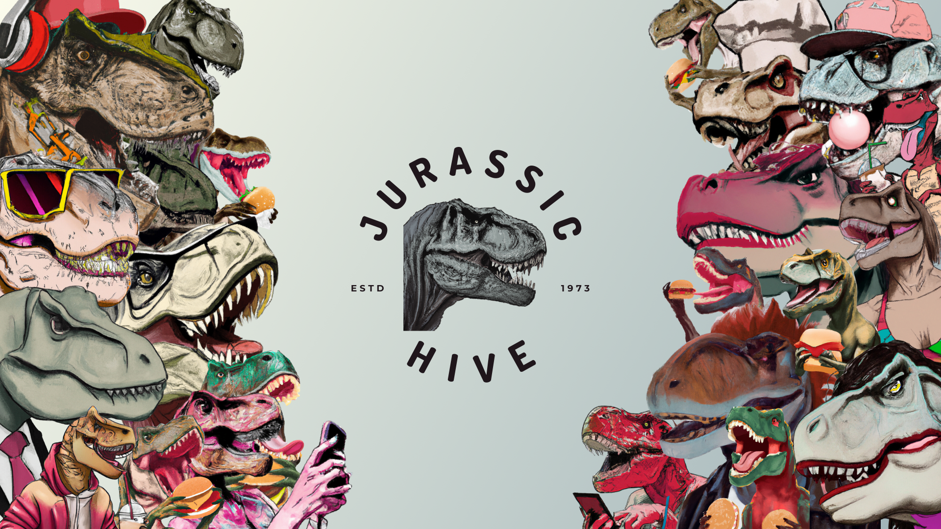
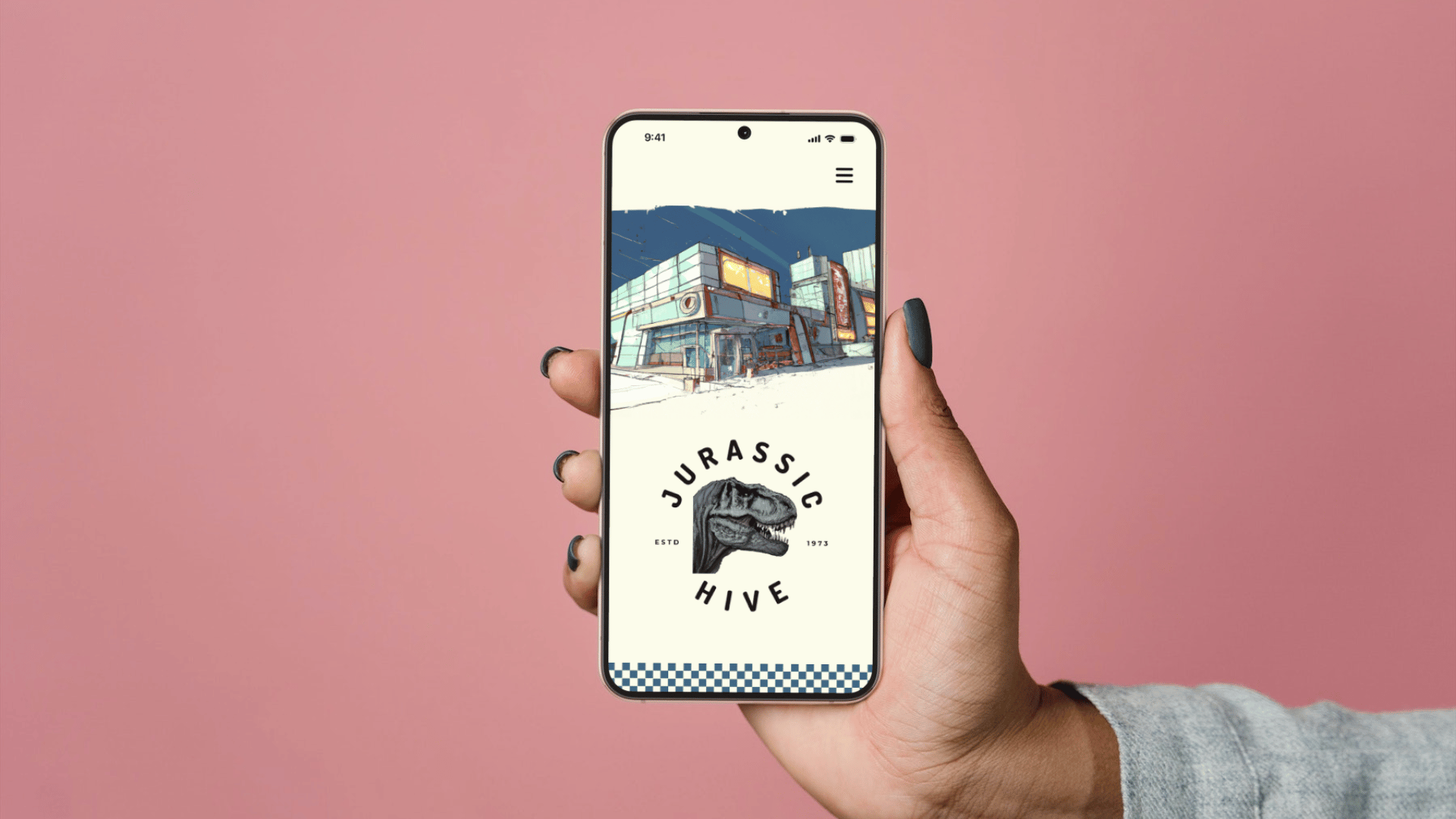
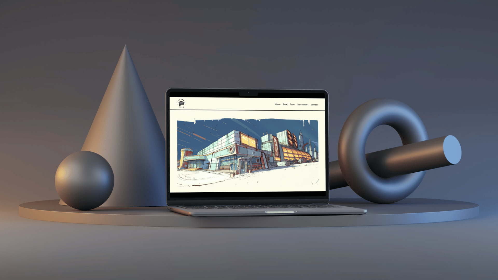
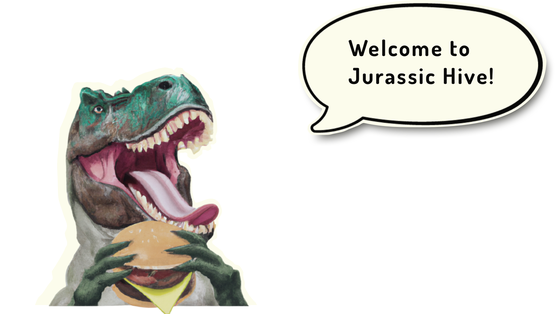
Welcome to Jurassic Hive,
where dinosaur-themed burgers
and milkshakes meet
futuristic nostalgia
in an American diner setting.
As the UI/UX designer
behind the brand,
I've crafted everything
from the logo to the website,
infusing it with fun, honesty,
and a getaway vibe.
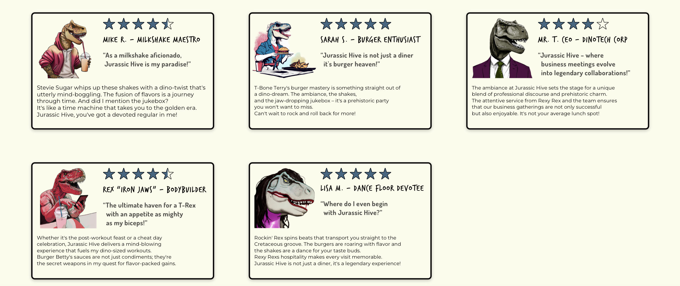
With quirky characters,
handcrafted imagery,
and a jukebox playing hot beats,
Jurassic Hive promises
an unforgettable dining experience.
Context
The Jurassic Hive UI/UX project
emerged from a desire
to bring together two seemingly
disparate worlds – the prehistoric
and the modern – into a seamless
digital experience.
Inspired by the idea
of an American diner for dinosaurs,
the project aimed to create
a visually captivating
and user-friendly website
that embodies the brand's ethos
of fun, entertainment, and escapism.
By infusing elements of nostalgia,
futuristic design, and mouthwatering imagery,
the goal was to transport visitors
into a world where burgers, milkshakes,
and good times reign supreme.
From conceptualizing the brand
to designing every pixel,
the project was a labor of love,
blending creativity with functionality
to deliver an immersive online journey
that mirrors the excitement
of dining at Jurassic Hive.
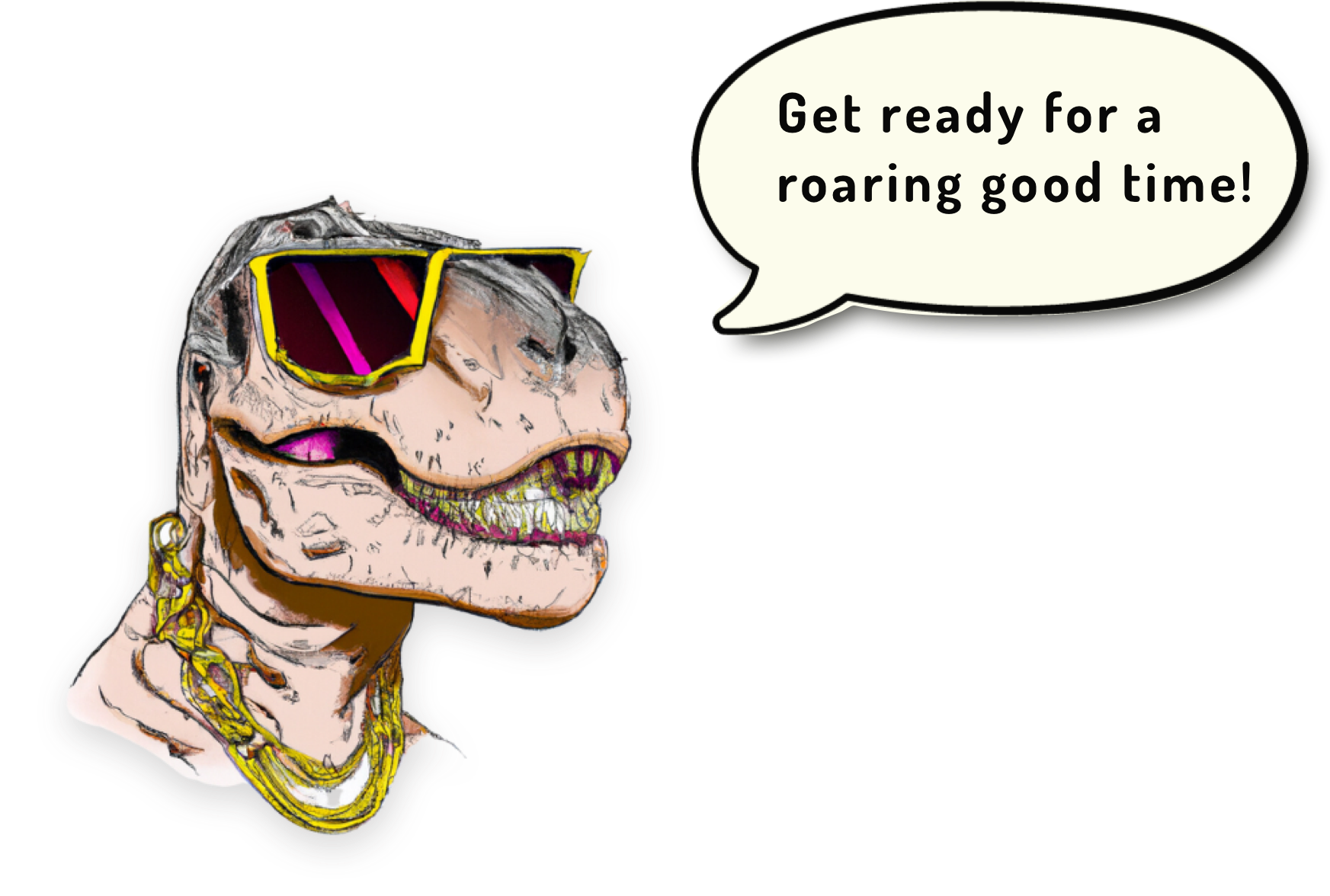
Objective
The objective of the Jurassic Hive
UI/UX project was clear:
to translate the vibrancy and
excitement of the imaginative restaurant
into an engaging digital space.
By creating a website that reflects
the brand's values of beeing clean,
entertaining and fun,
the goal was to attract
and captivate visitors,
enticing them to explore
and learn about the experience
and ultimately visit the diner.
With a focus on
user-friendly navigation,
visually appealing design,
and seamless functionality,
the objective was to ensure
that every interaction
with the website was as enjoyable
and memorable as a visit to
the Jurassic Hive diner itself.
Credits
In bringing Jurassic Hive to life,
I spearheaded:
Branding: Crafted vibrant branding
embodying fun and nostalgia.
Character Design: Created quirky personas
capturing the restaurant's essence.
Logo Design: Developed a captivating logo
as the brand's beacon.
Color & Typography: Selected colors and typography
balancing retro charm
and modern readability.
Image Style: Curated imagery transporting visitors
into the Jurassic Hive world.
User-Centric Design: Utilized empathy maps and personas
for user-centric design.
User Flow & Wireframes: Mapped user flows and crafted wireframes
from low to high fidelity.
Prototyping & Testing: Brought designs to life through prototyping
for immersive user testing.
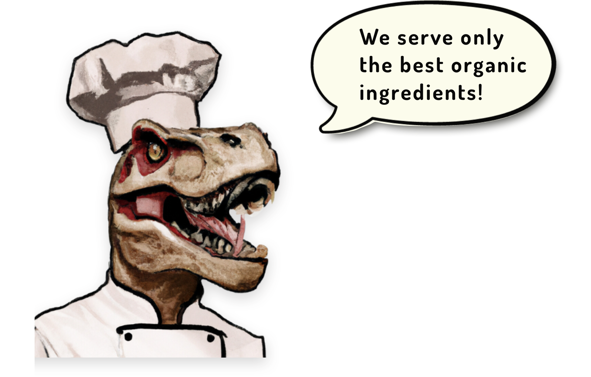
Brand Guidelines
Guiding Principles
For Jurassic Hive,
"clean, entertaining, fun"
aren't just words – they're
guiding principles
that shape every aspect
of the brand and user experience.
From designing our website
to crafting characters and imagery,
I ensure each element
reflects these principles.
Clean design ensures smooth
navigation, while entertaining elements
and a touch of fun
add excitement and joy
to the journey through Jurassic Hive.
Writing Style
In crafting the writing style
for Jurassic Hive,
I aimed for a balance
of playfulness and clarity.
Each word was carefully chosen
to evoke the excitement
and nostalgia of the diner
while ensuring the message
remained easy to understand.
By infusing a touch of humor
and personality, I aimed
to create an engaging tone
that resonates with the audience,
inviting them to explore
the world of Jurassic Hive
with enthusiasm and delight.
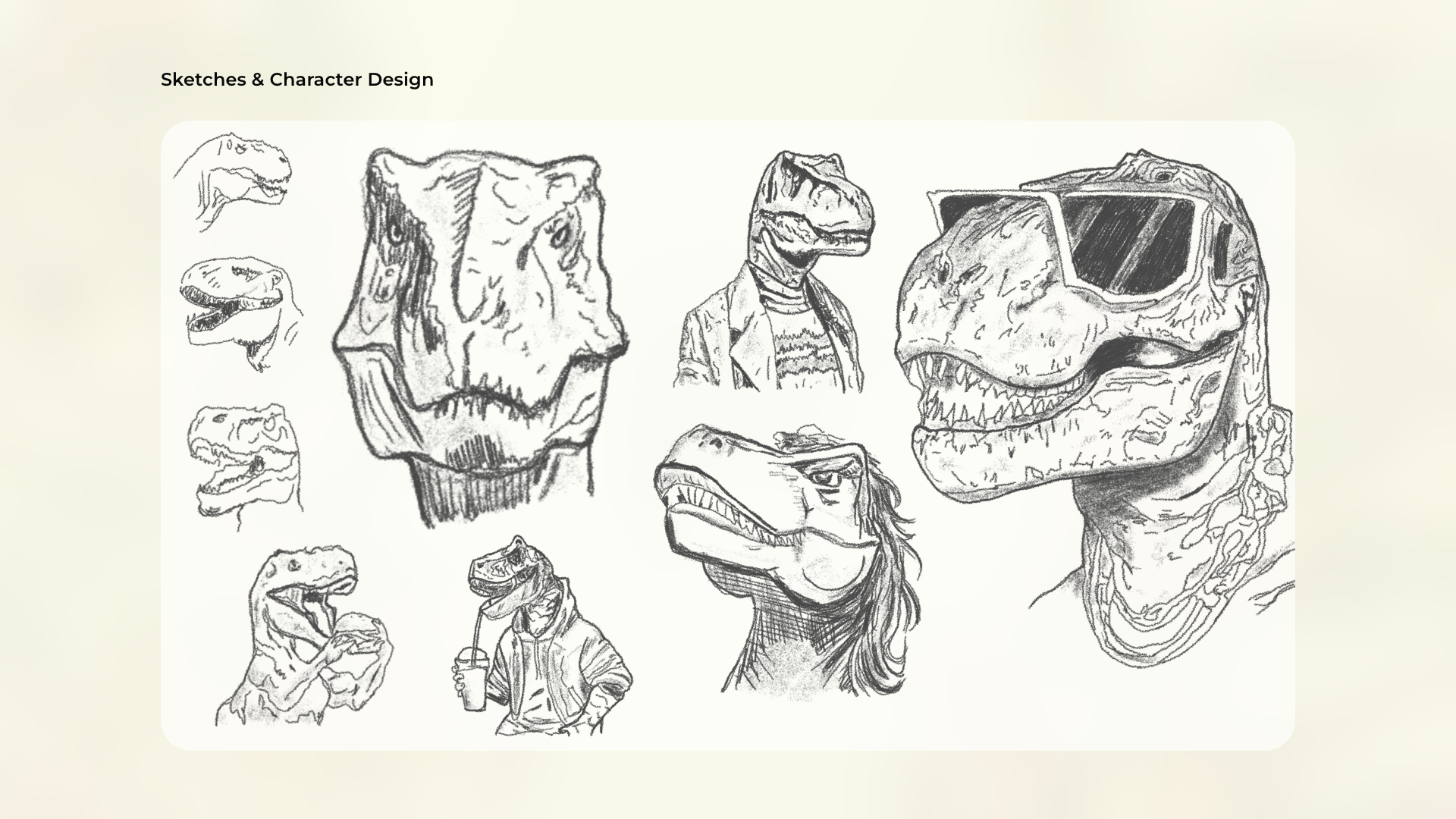
Sketches & Character Design

Sketching and character design
played a vital role in realizing
the Jurassic Hive experience.
Through countless sketches,
I breathed life into quirky
and lovable personas
that embody the spirit
of the diner.
Each character
was meticulously crafted
to evoke a sense of fun
and nostalgia, adding depth
and personality to the brand.
These sketches served as the blueprint
for the digital and physical presence,
ensuring that every aspect
of Jurassic Hive
exudes charm and charisma.
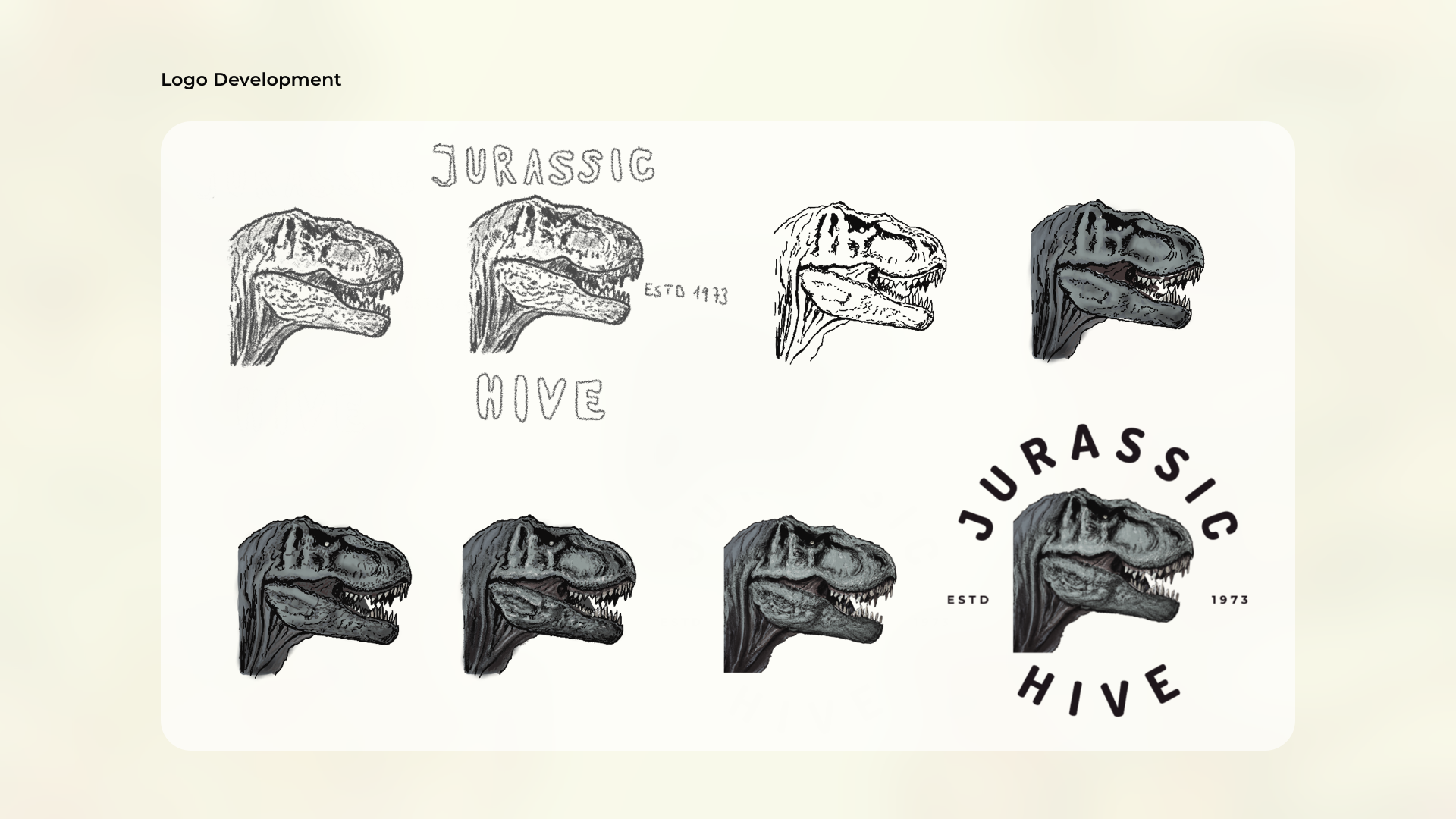
Logo Development

Crafting the logo for Jurassic Hive
was a journey of creativity and vision.
Through iterative sketches
and revisions, I honed in
on a design that captured
the spirit of the diner bold,
vibrant, and unforgettable.
Each element, from the typography
to the iconography,
was carefully considered to ensure
it resonated with our audience
while standing out
in a crowded digital landscape.
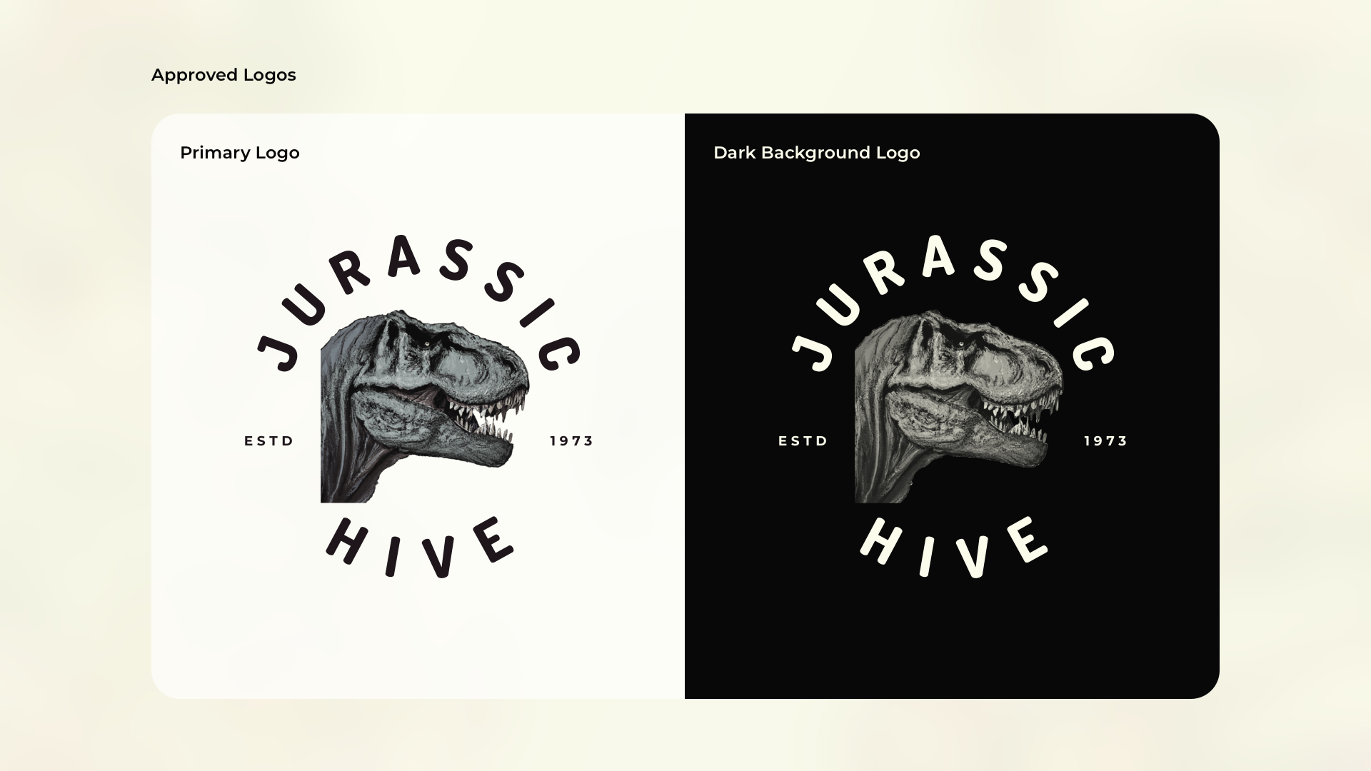
Approved Logo

The approved logo for Jurassic Hive
is a testament to our vibrant
and dynamic brand identity.
Designed to stand out
on both bright and dark backgrounds,
it captures the essence of the diner
with bold typography and playful iconography.
Whether it's displayed
against a sunny sky
or a starry night,
the logo remains
instantly recognizable.
Primary Color
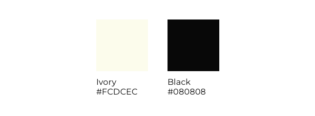
Using ivory as a primary color
for the background and black
as the primary color for text creates
a visually appealing and legible design.
Ivory, with its warm and subtle undertones,
imparts a sense of sophistication and elegance
to the overall aesthetic.
It's soft and neutral nature allows
for easy integration with various design elements,
making it a versatile choice for backgrounds.
On the other hand, black text against
an ivory background ensures
optimal readability and contrast.
Secondary Color

Pairing Payne's Grey secondary color
for design elements
and Davy's Grey for secondary text
creates a harmonious and
sophisticated visual composition.
Payne's Grey, with it’s deep and
muted tones, serves as an excellent choice
for design accents, adding depth
and a touch of refinement
to the overall palette.
It’s versatility allows it to complement
the primary colors while maintaining
a sense of cohesion.
Davy's Grey lighter and softer shade,
serves as an ideal secondary text
color, providing legibility and
a subtle contrast against ivory
for the background.
Typography
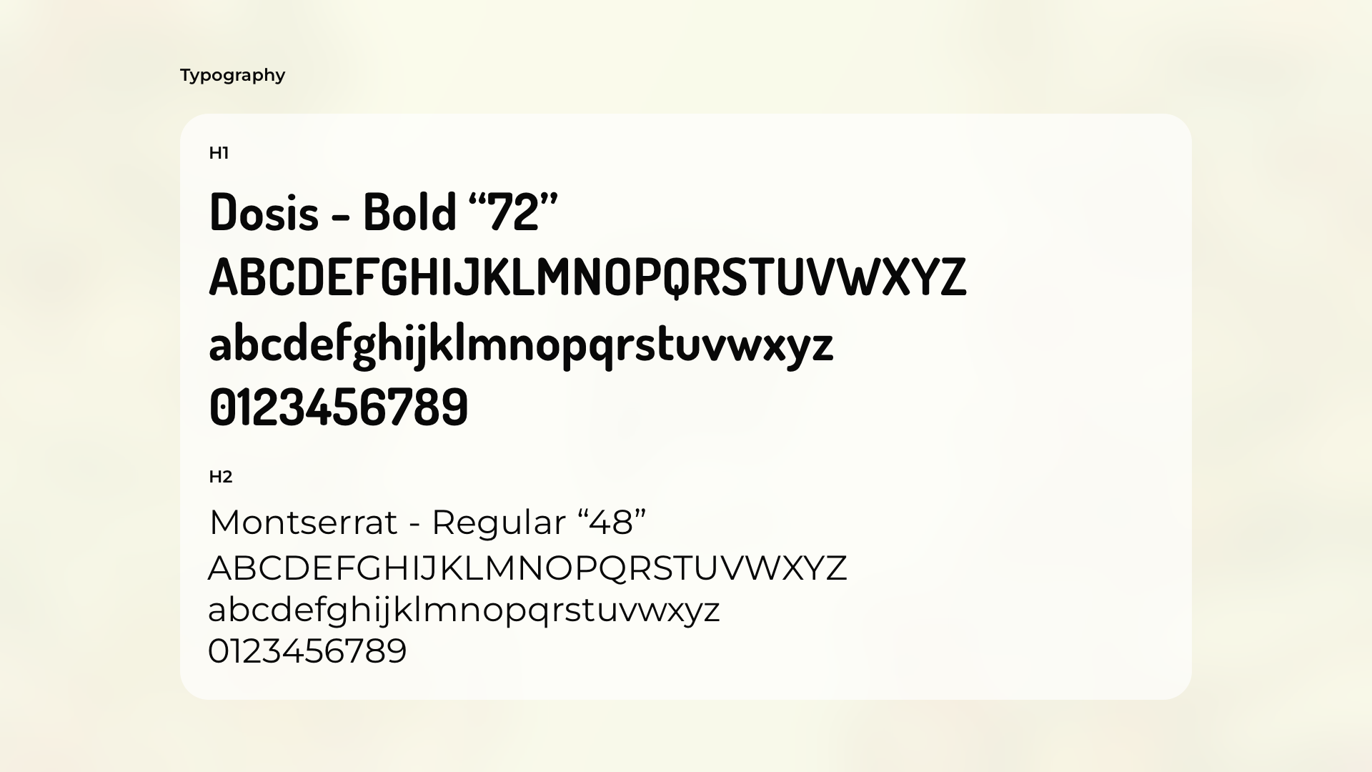
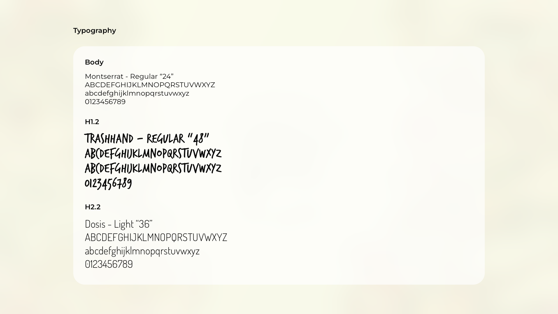
Typography at Jurassic Hive
is a careful curation, ensuring readability
and personality across all platforms.
In most sections, I use Dosis Bold
for headlines, commanding attention
with its bold and modern style.
However, in the team
and testimonial sections, I introduce
an extra touch of playfulness
by employing Trashhand Regular
for headings and Dosis Light
for subheadings, enhancing
the energetic atmosphere.
Throughout the website,
body text remains consistent
with Montserrat Regular,
providing a clean and legible foundation
for conveying information.
This thoughtful combination of fonts
enhances the overall user experience,
guiding visitors through the website
with clarity and style.
Image Style
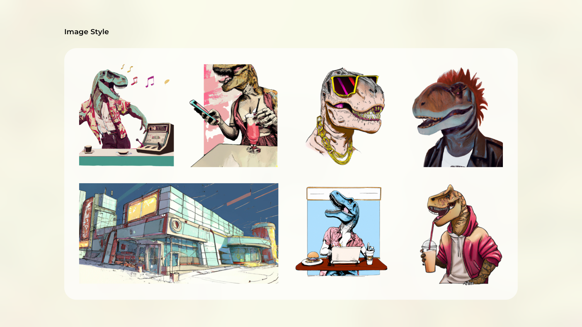
Choosing self-made, comic-style imagery
for Jurassic Hive adds a playful and
memorable touch to the brand.
The hand-drawn illustrations
create a unique, entertaining atmosphere,
showcasing dinosaurs in amusing scenarios.
This approach resonates with adiverse
audience, contributing to the diner's
casual and fun ambiance, making it
a lively destination for patronsbr
to enjoy meals with a nostalgic
and adventurous flair.
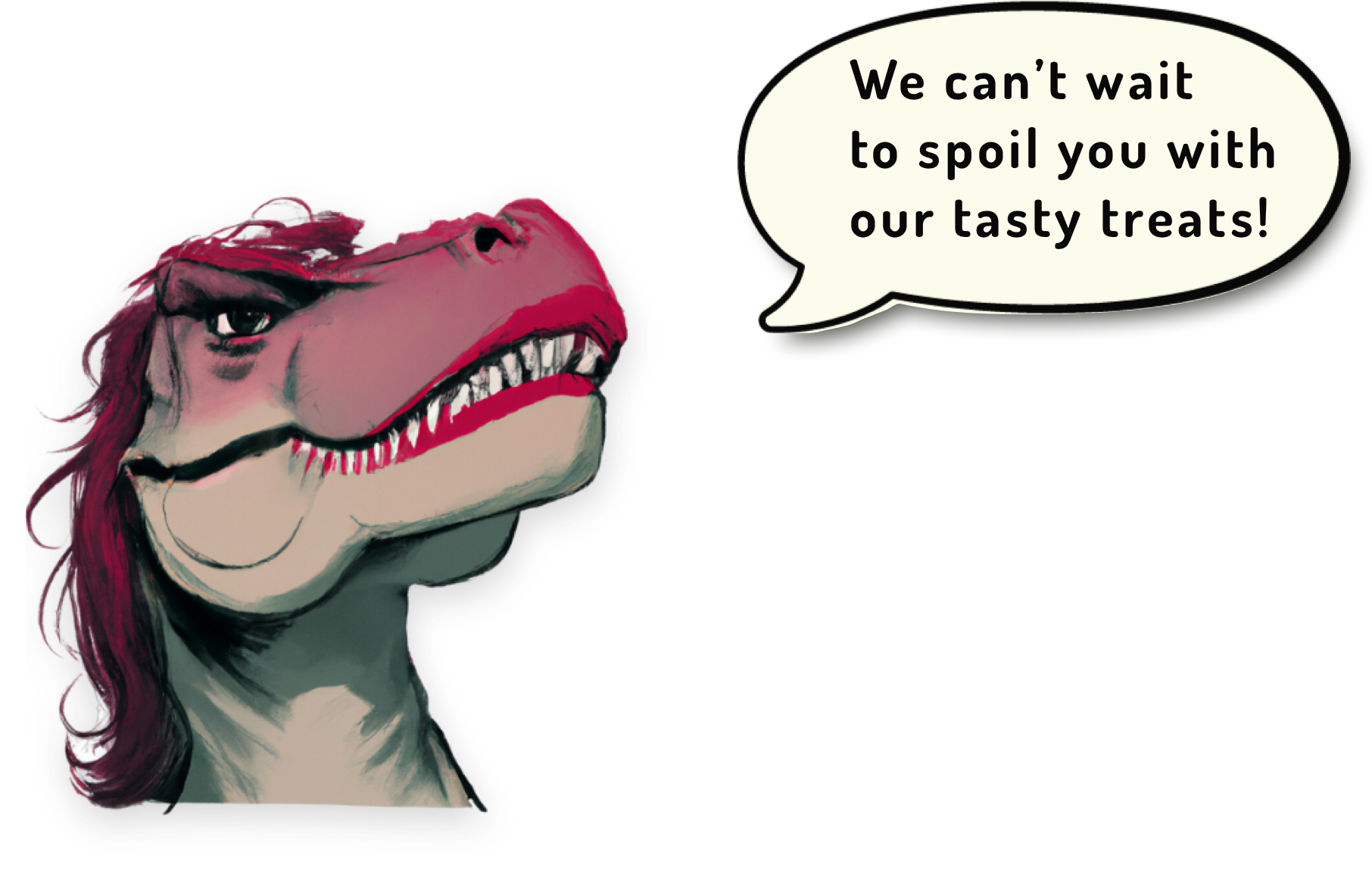
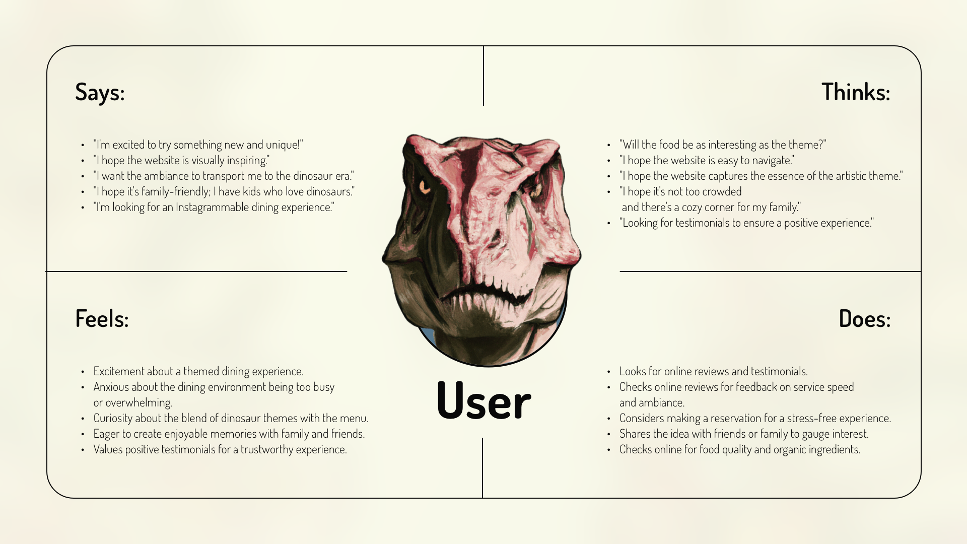
Empathy Map

In shaping the user experience
for Jurassic Hive,
empathy maps were invaluable.
They allowed me to delve deep
into the minds of our target audience,
understanding their needs,
desires, and pain points.
By putting myself in their shoes,
I could design with empathy,
ensuring every interaction with the website
resonated with their emotions and motivations.
This empathetic approach was crucial
in creating a digital space
that truly connects with our visitors
on a personal level,
enhancing their overall experience
at Jurassic Hive.
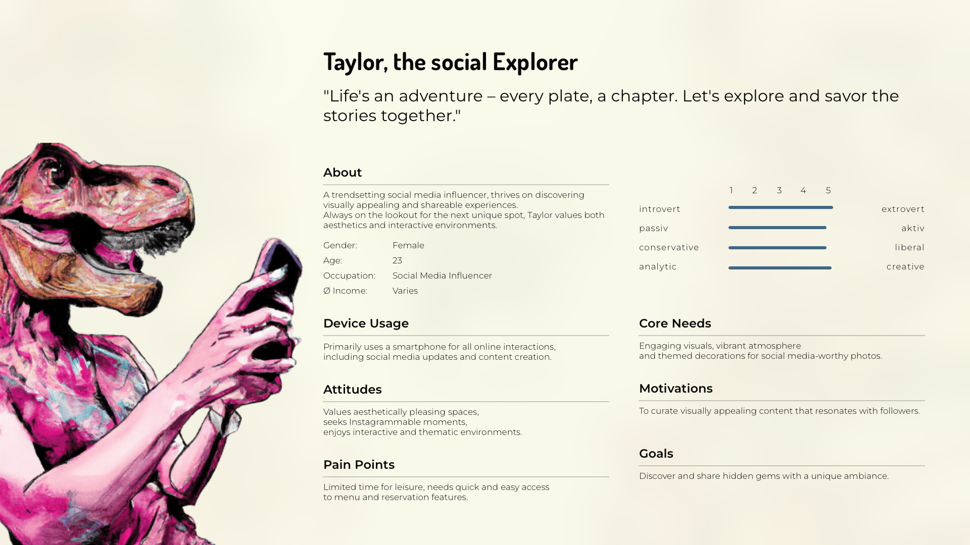
Personas
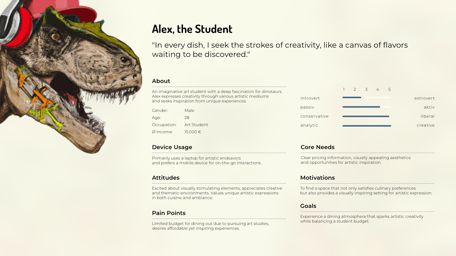
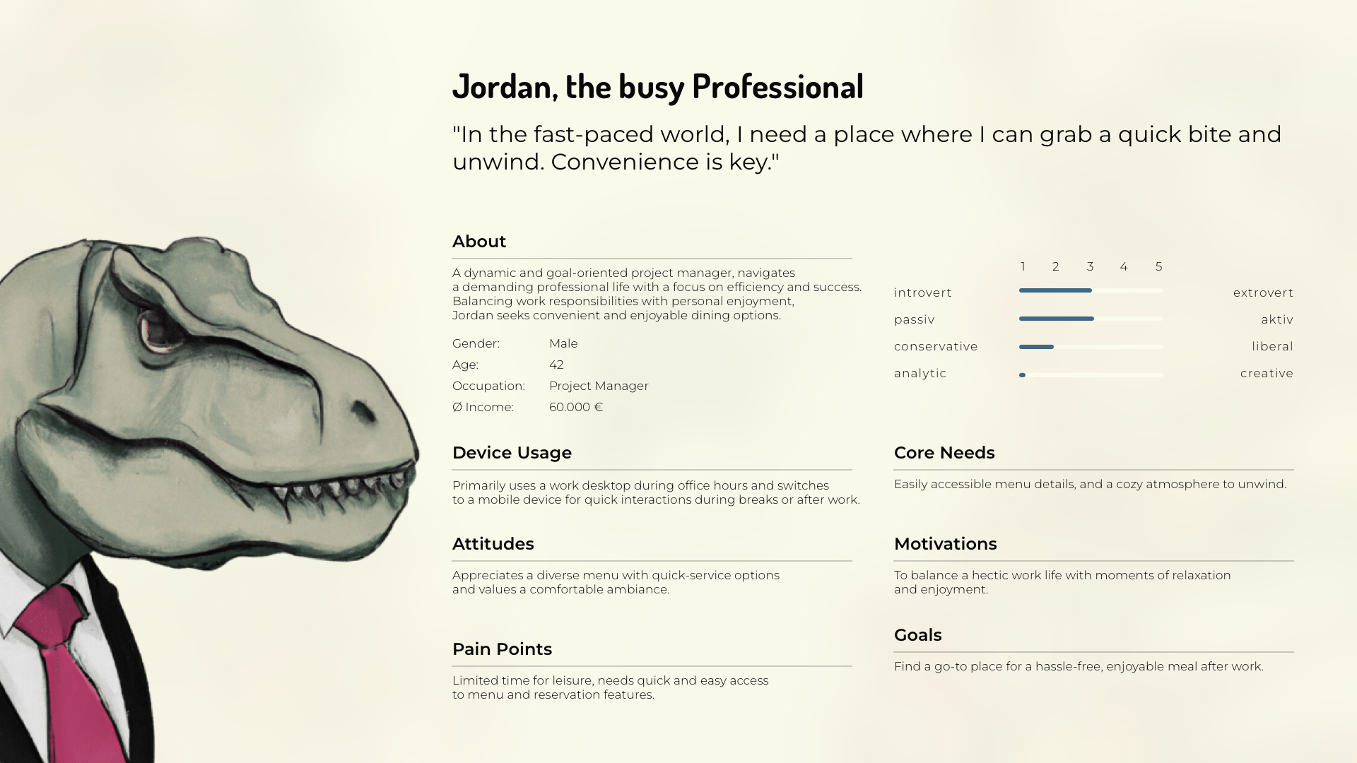

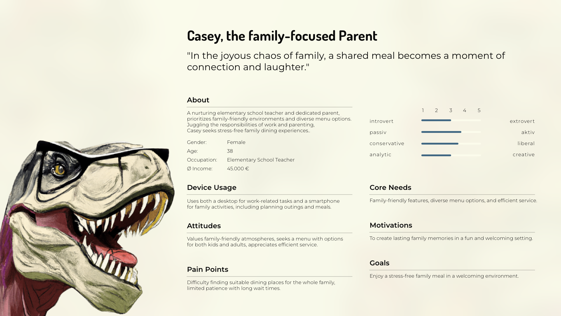
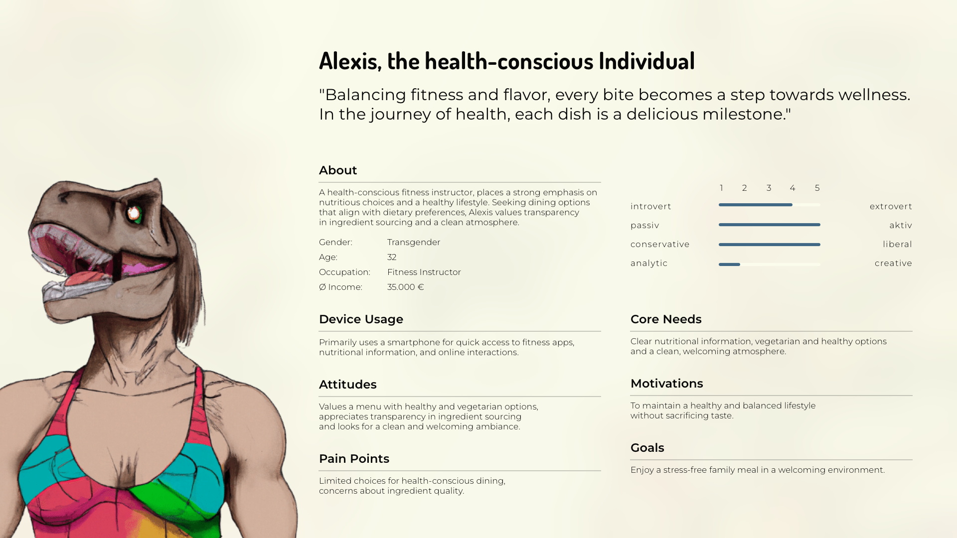
Crafting personas for Jurassic Hive
was an illuminating journey.
Immersing myself in the minds
of our target audience,
I gained insights into their needs,
preferences, and behaviors.
Through this process,
I developed detailed profiles
representing various segments
of our customer base.
These personas served as
invaluable guides,
shaping design decisions
to ensure the website
resonated deeply with users.
By empathizing with their perspectives,
I crafted a digital experience
tailored to their desires,
enriching their exploration
of Jurassic Hive.
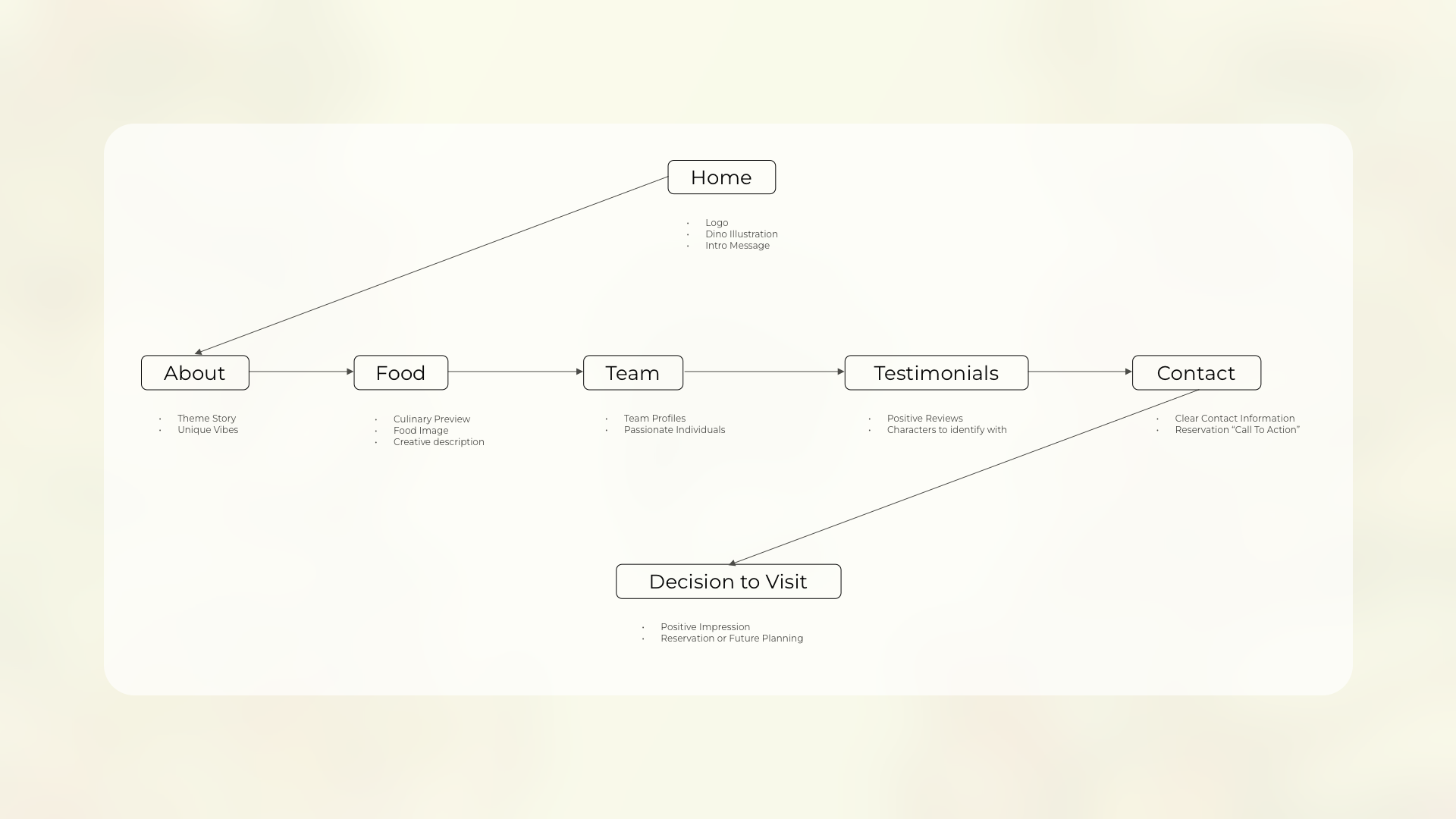
User Flow Diagram

Creating the user flow diagram
for Jurassic Hive was a pivotal step
in crafting a seamless digital experience.
It allowed me to visualize the journey
our users would take through the website,
from landing on the homepage
to finaly making the decision
to visit Jurassic Hive.
By mapping out every step and interaction,
I could identify potential pain points
and streamline the navigation
to ensure a smooth and intuitive experience.
This user-centric approach ensured
that visitors could easily find
what they were looking for,
ultimately enhancing their satisfaction
and engagement with Jurassic Hive.
Wireframes - Mobile
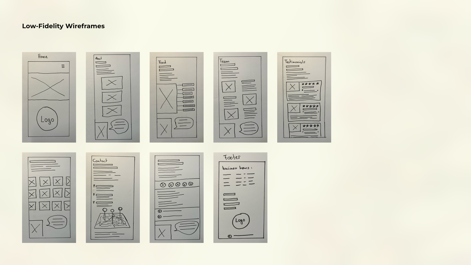
Low-Fidelity-Wireframes

In the initial stages
of designing Jurassic Hive,
I relied on scribbles and
low-fidelity wireframes
to flesh out ideas and concepts.
These rough sketches allowed me
to quickly iterate and explore different
layout options and user flows.
By embracing simplicity
and focusing on the core elements,
I could efficiently communicate
design concepts and
gather feedback from stakeholders.
These low-fidelity wireframes
served as the foundation
for the more detailed designs
that followed, ensuring that
every aspect of the user experience
was carefully considered from the outset.
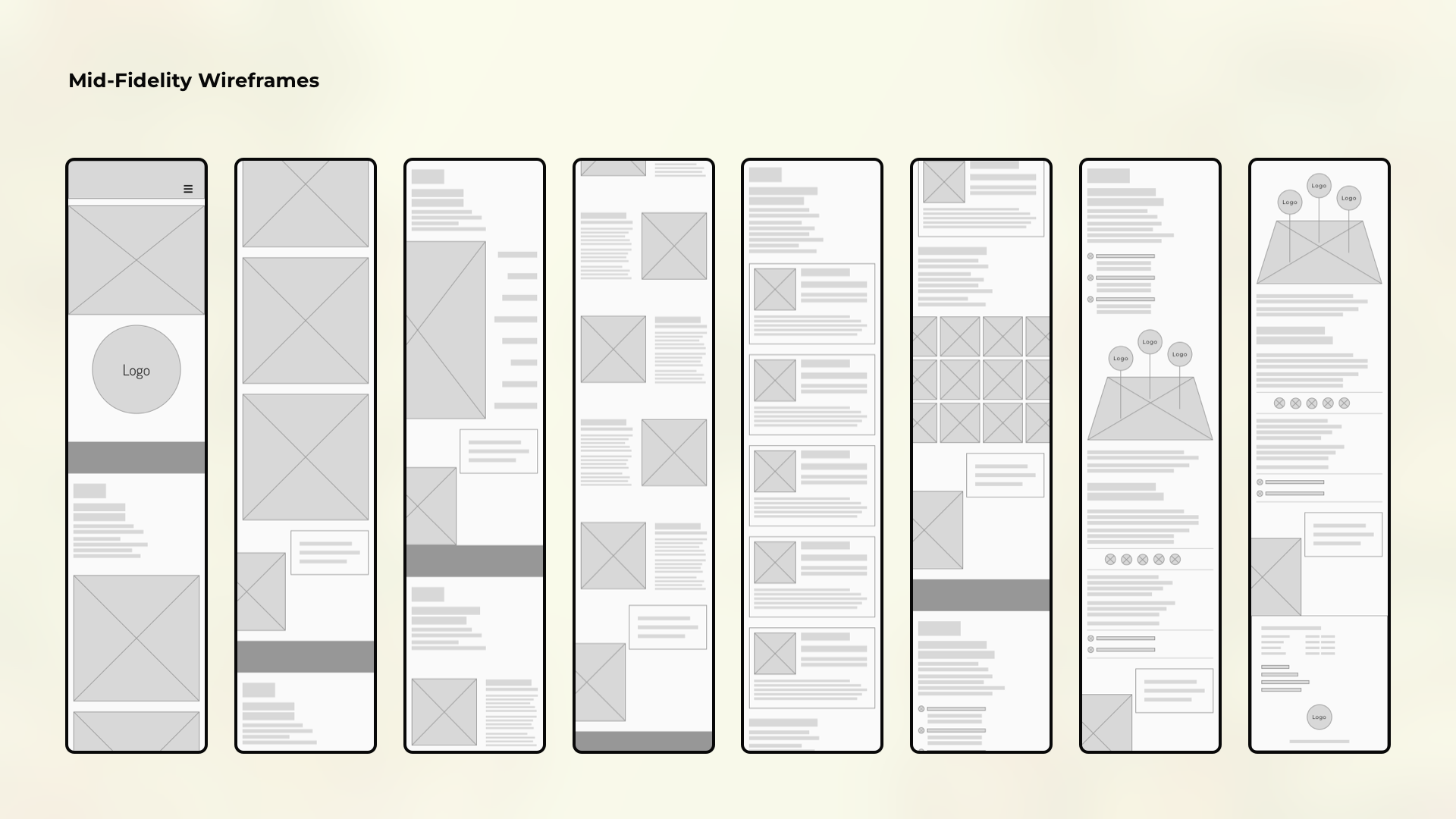
Mid-Fidelity-Wireframes

As I transitioned to mid-fidelity wireframes,
I elevated the level of detail
while maintaining a focus on
usability and functionality.
These wireframes provided
a clearer picture of the layout,
content hierarchy,
and interaction elements,
allowing me to refine
the user experience further.
By adding more visual elements
and refining the design elements,
I could better convey the overall look
and feel of the website.
These mid-fidelity wireframes served
as a crucial step in the design process,
bridging the gap between concept
and implementation while ensuring
that the final product would meet both
user needs and business goals.
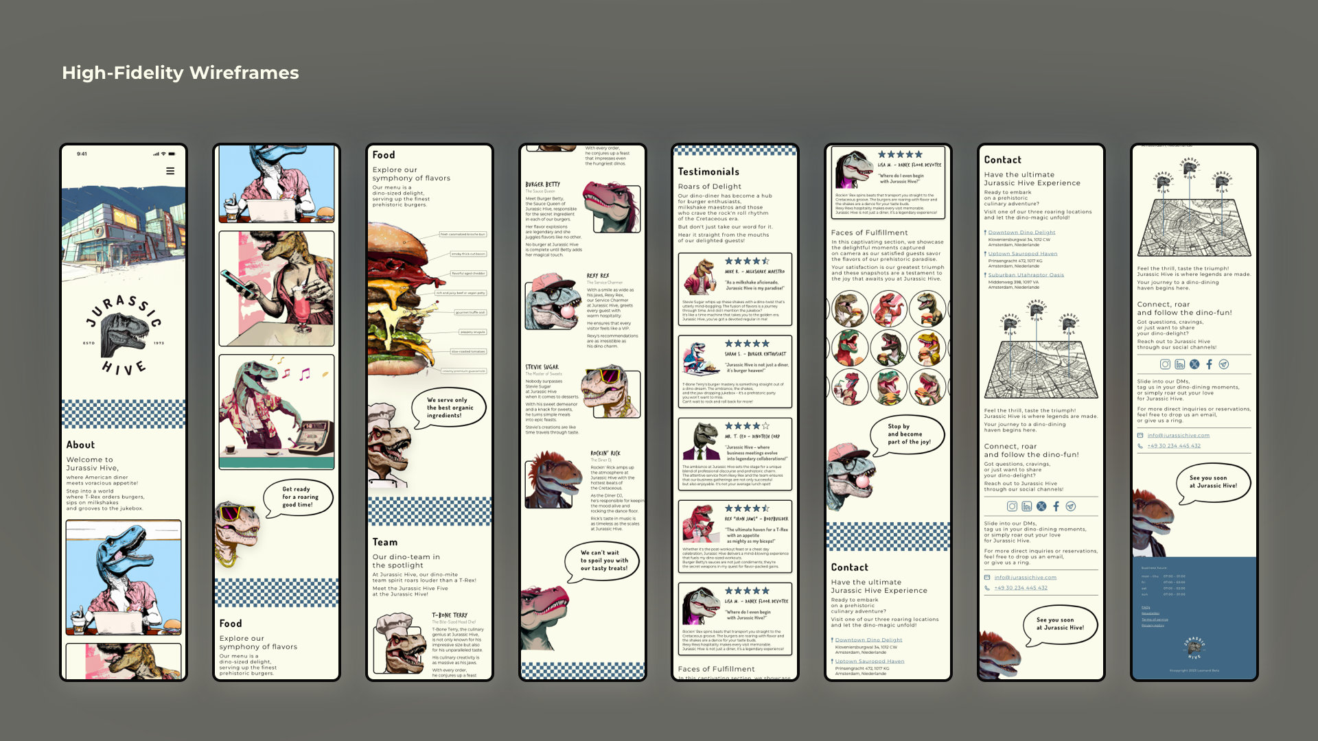
High-Fidelity-Wireframes

In developing high-fidelity wireframes,
I brought the design to life
with polished visuals and refined details.
Every element was meticulously crafted
to accurately represent the final product,
from typography and colors to imagery.
These wireframes provided
a comprehensive blueprint for
the website's development,
ensuring a seamless transition
from design to implementation.
By incorporating feedback from user testings,
I fine-tuned the high-fidelity wireframes
to deliver an engaging and
user-friendly experience
that captures the essence of Jurassic Hive.
Wireframes - Desktop
Mid-Fidelity-Wireframes
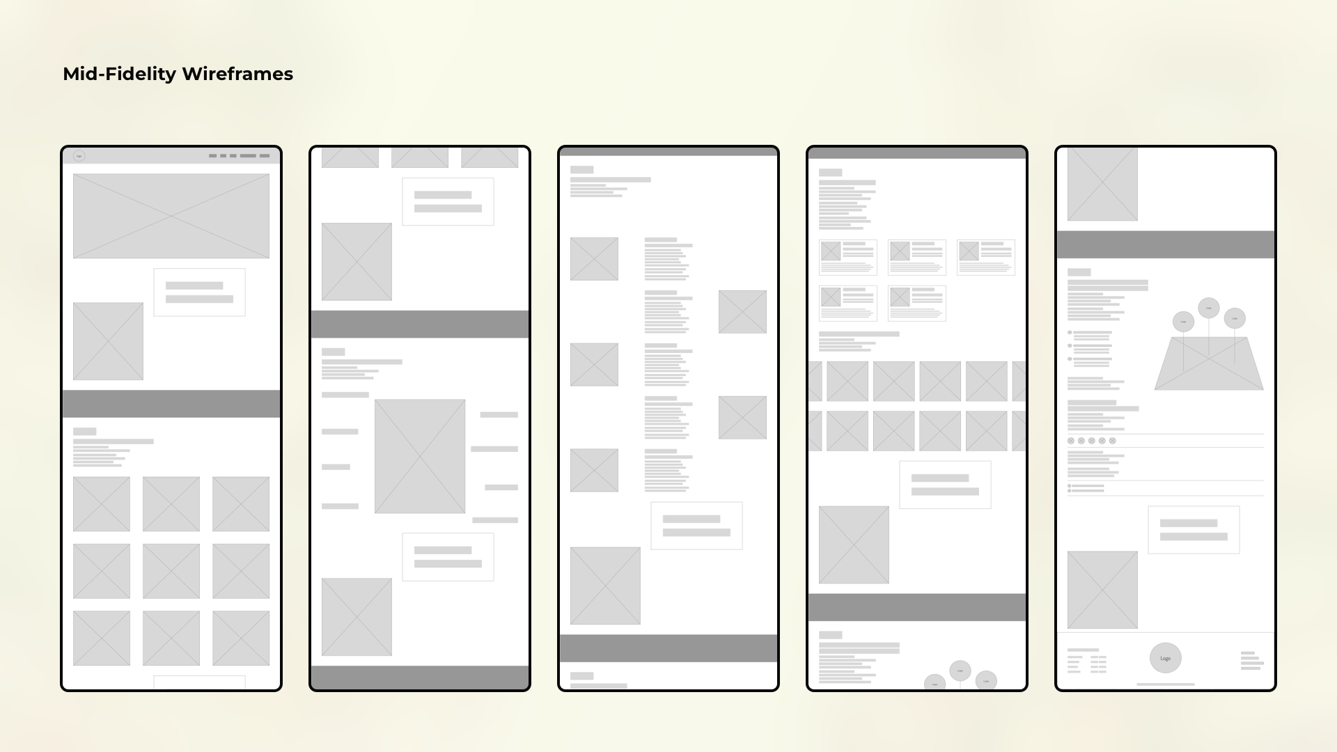
In creating mid-fidelity wireframes
for Jurassic Hive's desktop version,
I prioritized responsive design principles.
These wireframes served as
a flexible foundation,
ensuring seamless adaptability
across various screen sizes and devices.
By incorporating elements
like fluid grids and scalable components,
I aimed to maintain consistency
and usability regardless
of the user's device.
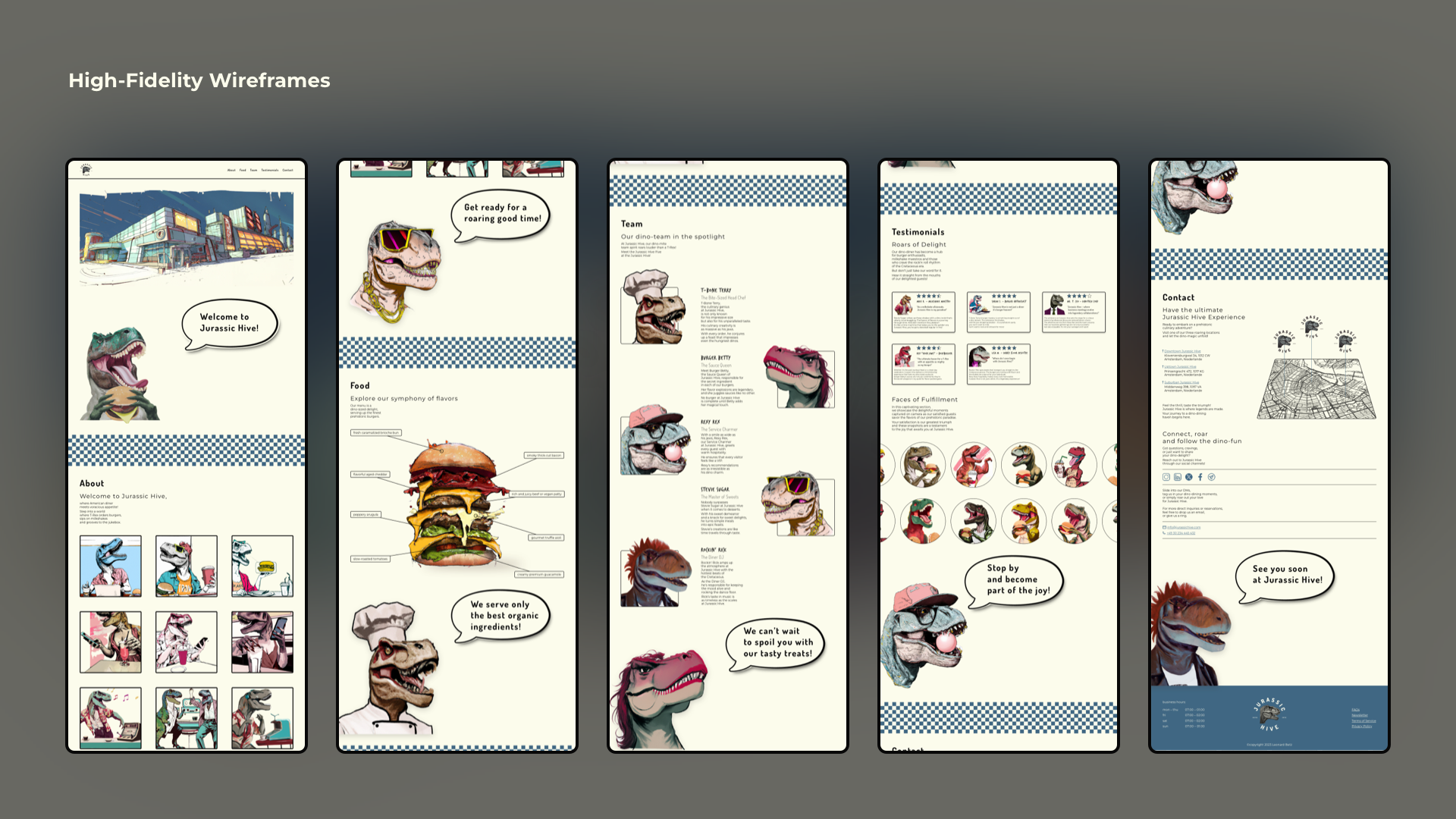
High-Fidelity-Wireframes

For the high-fidelity wireframes
of Jurassic Hive's desktop version,
I focused on refining every detail
to create a visually stunning
and immersive experience.
I ensured that every element
was pixel-perfect and aligned
with the brand's aesthetic.
By incorporating responsive design principles,
I guaranteed that the desktop interface
would seamlessly adapt
to various screen sizes
without compromising on usability
or visual appeal.
These high-fidelity wireframes set the stage
for the development of a desktop experience
that captivates users and
brings the Jurassic Hive brand to life.
Bizzling

Overview

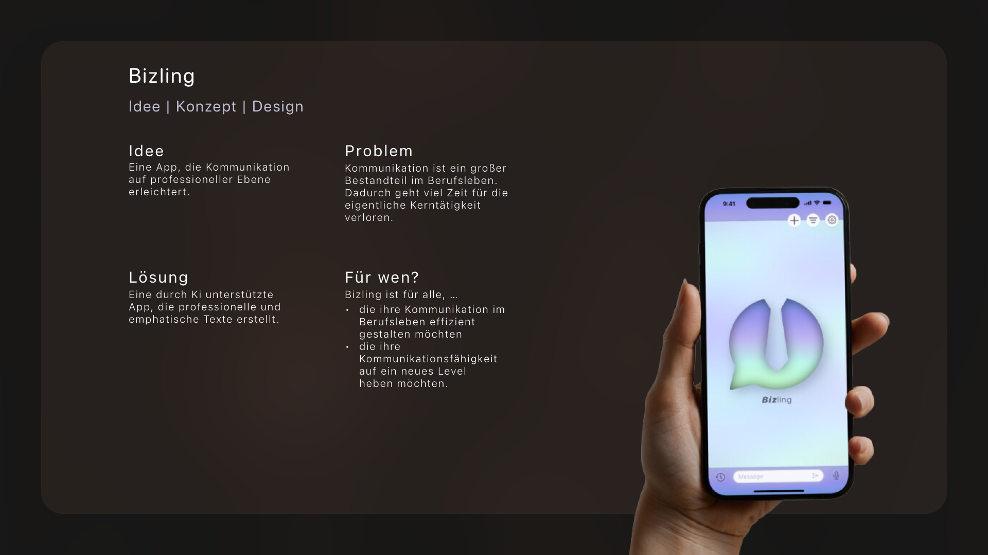
Welcome to Bizling – your ultimate solution for efficient and empathetic
communication in the professional world!
Say "Goodbye" to endless drafts and "Hello" to professional, time-saving
messages
with a touch of humanity.
With this AI-powered app, you can effortlessly create professional and
empathetic
texts, so you have more time for what matters!
Whether you want to improve your communication skills or simply spend less time
crafting emails – Bizling is here for you.
Context
The idea for Bizling came to me when I found myself trapped in endless email
loops,
losing valuable time for my core tasks.
I knew there had to be a better solution. So, I set out to bridge the gap
between
efficiency and empathy.
My design process was a blend of creativity, research, and relentless iteration.
I aimed to create an app that wasn't just functional but also humane – one that
understands and supports users' needs.
Objective
My objective in creating Bizling was to revolutionize professional communication
by
providing users with a tool that streamlines the process while maintaining a
human
touch.
I aimed to empower individuals to navigate the demands of modern work
environments
with ease, saving time and reducing stress associated with crafting effective
messages.
By harnessing the power of AI and intuitive design, my goal was to equip users
with
a solution that not only enhances efficiency but also fosters genuine
connections in
the workplace.
Ultimately, Bizling was designed to be more than just an app, it's a partner in
productivity, helping users communicate confidently and effectively in their
professional endeavors.
Credits
For this project, I was a UI/UX Designer who:
- Led conceptualization and ideation sessions, generating innovative ideas and concepts for the Bizling app.
- Conducted comprehensive user research, including surveys, interviews, and usability testing, to gain insights into the needs and preferences of our target audience.
- Created detailed personas based on the research findings, providing a clear understanding of our users' goals, motivations, and pain points.
- Utilized empathy mapping techniques to gain deeper insights into the emotions, motivations, and behaviors of our users, ensuring a more empathetic and user-centric design approach.
- Crafted both low-fidelity and high-fidelity wireframes, along with interactive prototypes, to visualize and refine the user interface and experience.
- Applied creative skills to develop the visual identity of Bizling, including logo design and branding elements such as color schemes, typography, and iconography.
- Conducted usability testing sessions with prototypes, gathered feedback from users, and iterated on the design based on their insights to ensure a user-centric approach.
- Developed a comprehensive Style Guide, which provides clear instructions for visual elements like color palettes, typgraphy and iconography, ensuring consitency across Bizling's cohesive appearance, reinforcing Bizling's brand identity and delivering a unified user experience.
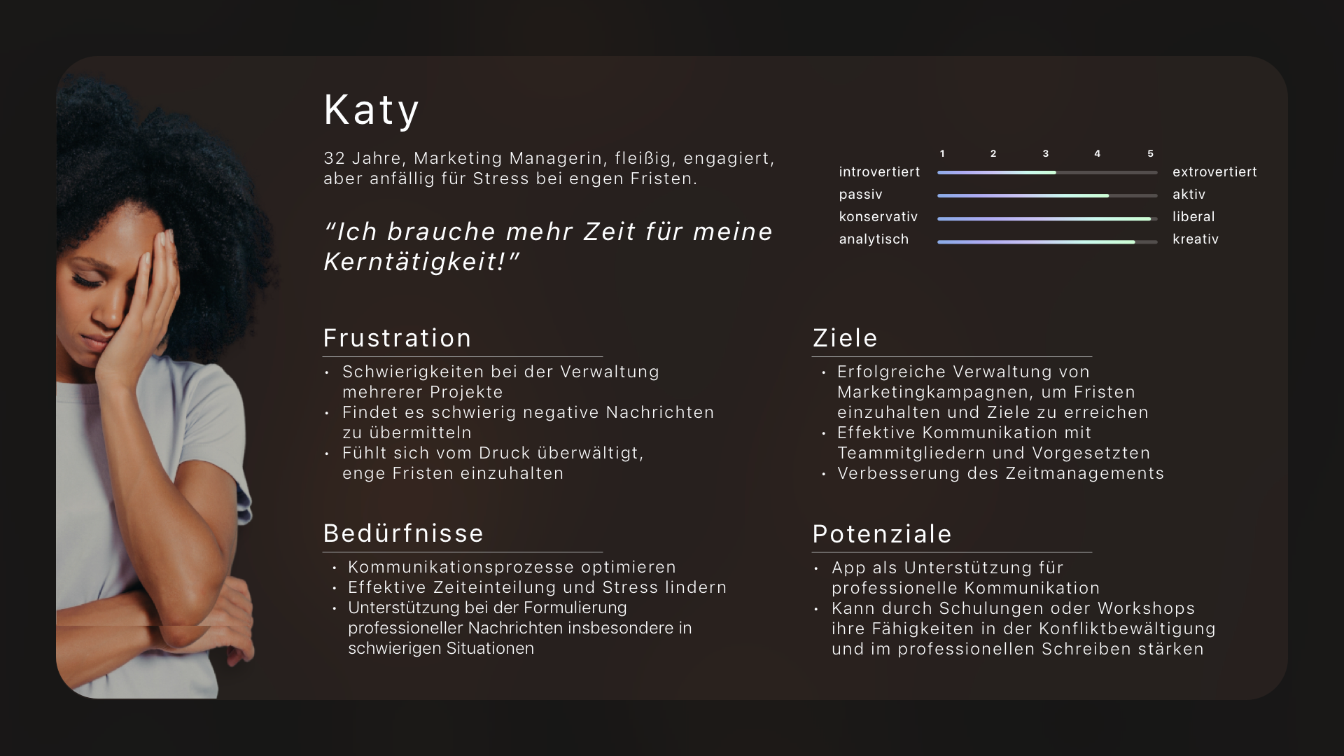
Personas

Creating personas was pivotal in guiding my design process for Bizling.
By developing detailed profiles representing our target users,
I gained a deep understanding of their goals, needs, and pain points.
These personas served as a compass,
ensuring that every design decision aligned with the preferences and behaviors
of the intended audience.
With personas in hand, I was able to empathize with users on a personal level,
allowing me to tailor the user experience to their specific requirements.
Ultimately, this approach facilitated the development of a user-centric
interface
that resonates with the audience and enhances their communication experience
with
Bizling.
Empathy Map
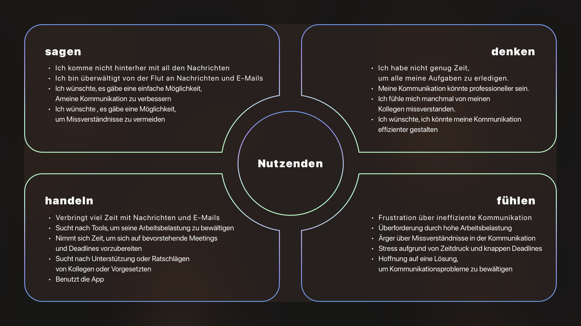
Utilizing an empathy map proved invaluable
during the design journey of Bizling.
By visually mapping out the thoughts,
feelings, and motivations of my target users,
I gained profound insights
into their emotional landscape.
This helped me empathize deeply
with their experiences and understand
their perspectives more holistically.
By identifying pain points, aspirations
and influencers, I honed in on key areas
where Bizling could make a meaningful impact
on their professional communication challenges.
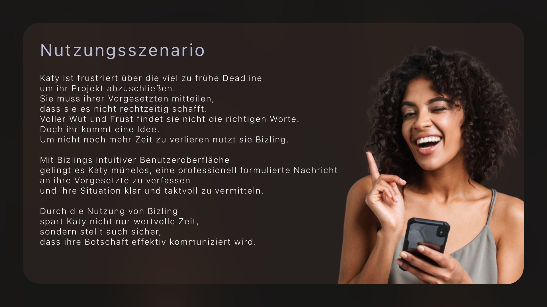
Use Case Scenario

The usage scenario of Katy, frustrated by an early deadline
and using Bizling to communicate professionally with her supervisor,
was pivotal in shaping the development of the app.
By identifying such situations during the design process,
I gained a deeper understanding of the users' needs and challenges.
This scenario helped me prioritize creating
a solution that is not only efficient but also empathetic.
By assisting Katy in a moment of frustration,
Bizling ensures that the app not only enhances efficiency
but also contributes to fostering positive interpersonal
relationships in the professional environment.
Ultimately, this usage scenario guided me
in developing an app that is not only practical
but also empathetic, meeting the diverse demands of professional communication.
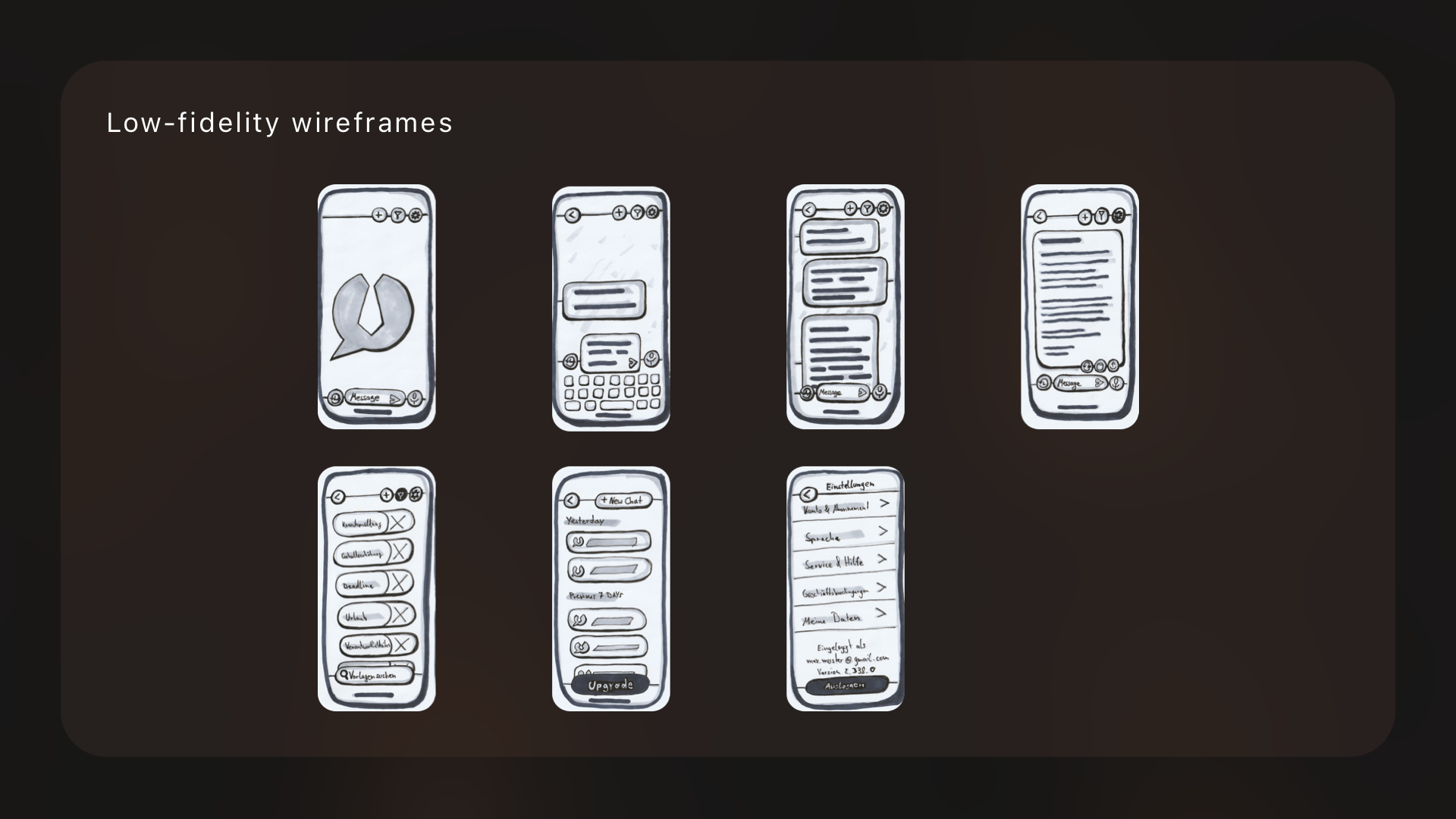
Scribbles / Wireframes

The process of sketching and creating low-fidelity wireframes
played a crucial role in the design process of Bizling.
By quickly scribbling ideas on paper
and translating them into simple wireframes,
I was able to explore various design concepts rapidly.
This approach facilitated early feedback from stakeholders
and allowed me to iterate on the design efficiently.
Low-fidelity wireframes helped me
focus on the core functionality and user flow of the app
without getting bogged down in unnecessary details.
Additionally, they served as a blueprint for the UI design,
guiding the creation of high-fidelity prototypes.
Overall, this iterative process of sketching and wireframing
significantly contributed to the development
of a user-friendly and intuitive interface for Bizling.
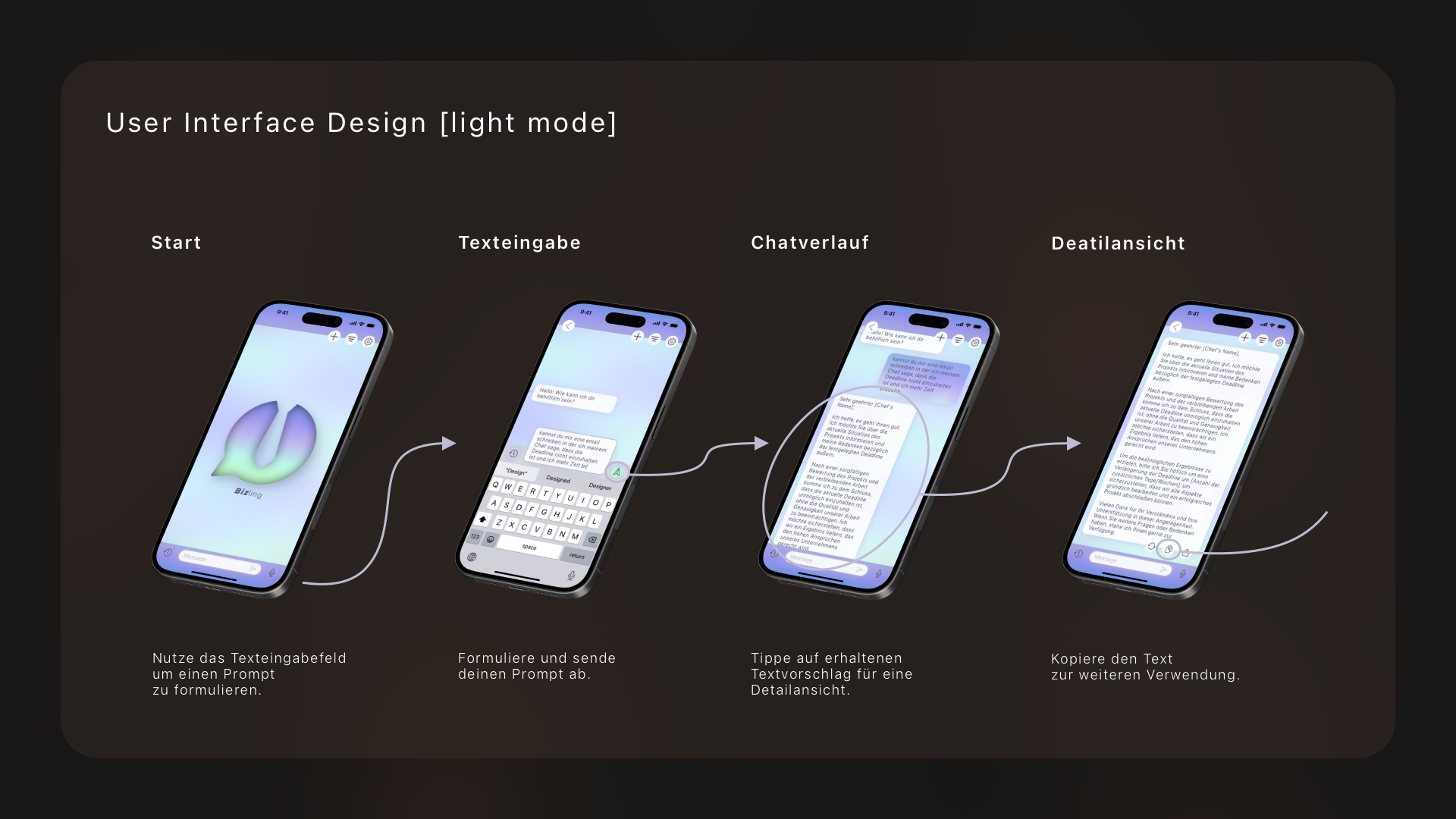
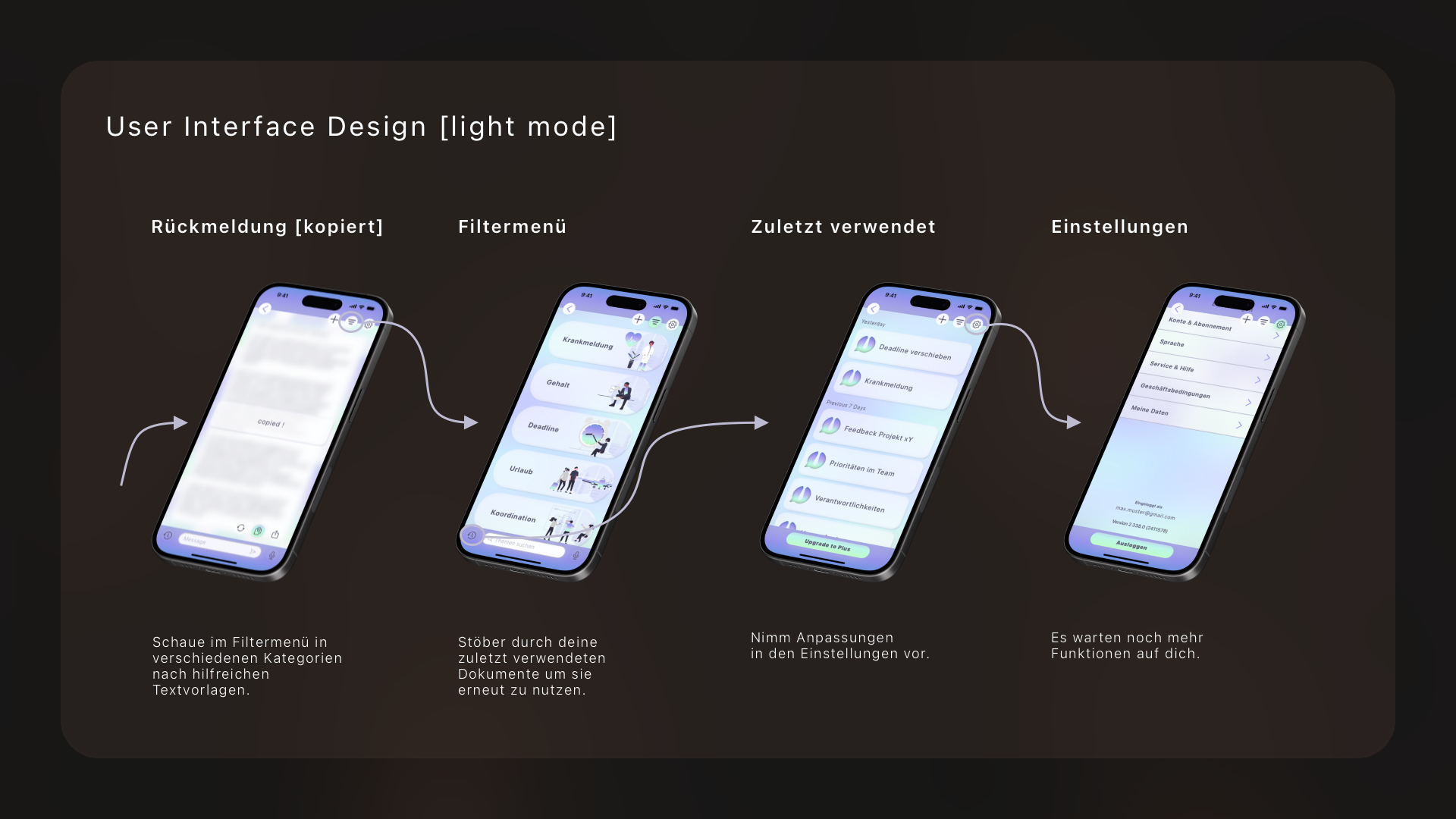
High-fidelity wireframes (light mode)

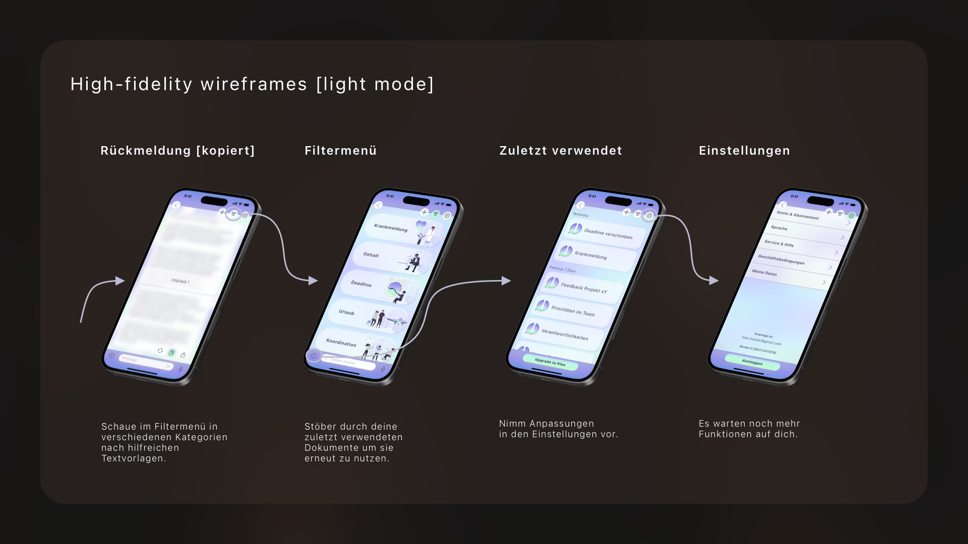
High-fidelity wireframes were a game-changer
in my design process for Bizling.
They allowed me to take my initial concepts
and transform them into polished,
pixel-perfect representations of the app interface.
With these detailed wireframes,
I could fine-tune every element,
from color schemes to button placements,
ensuring a cohesive and user-friendly design.
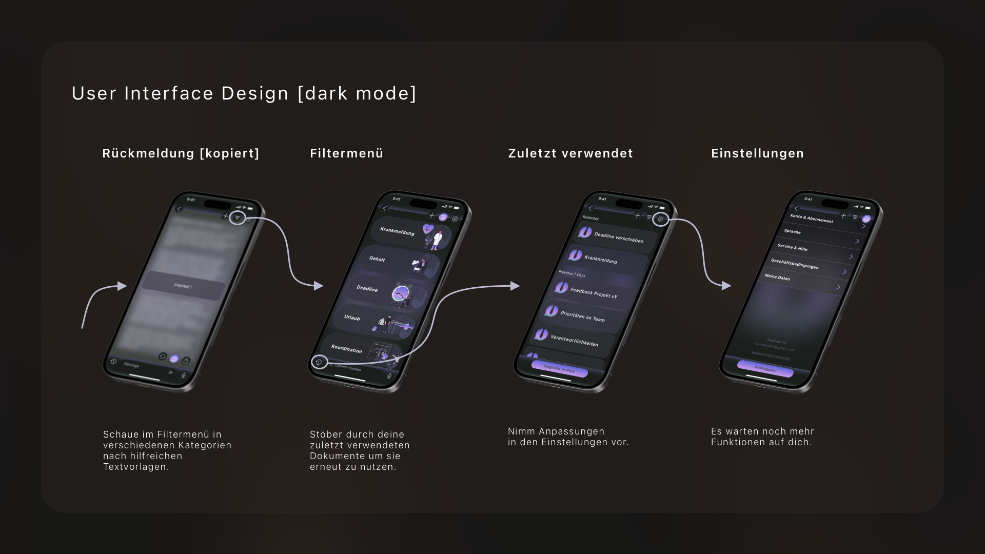
High-fidelity wireframes (dark mode)
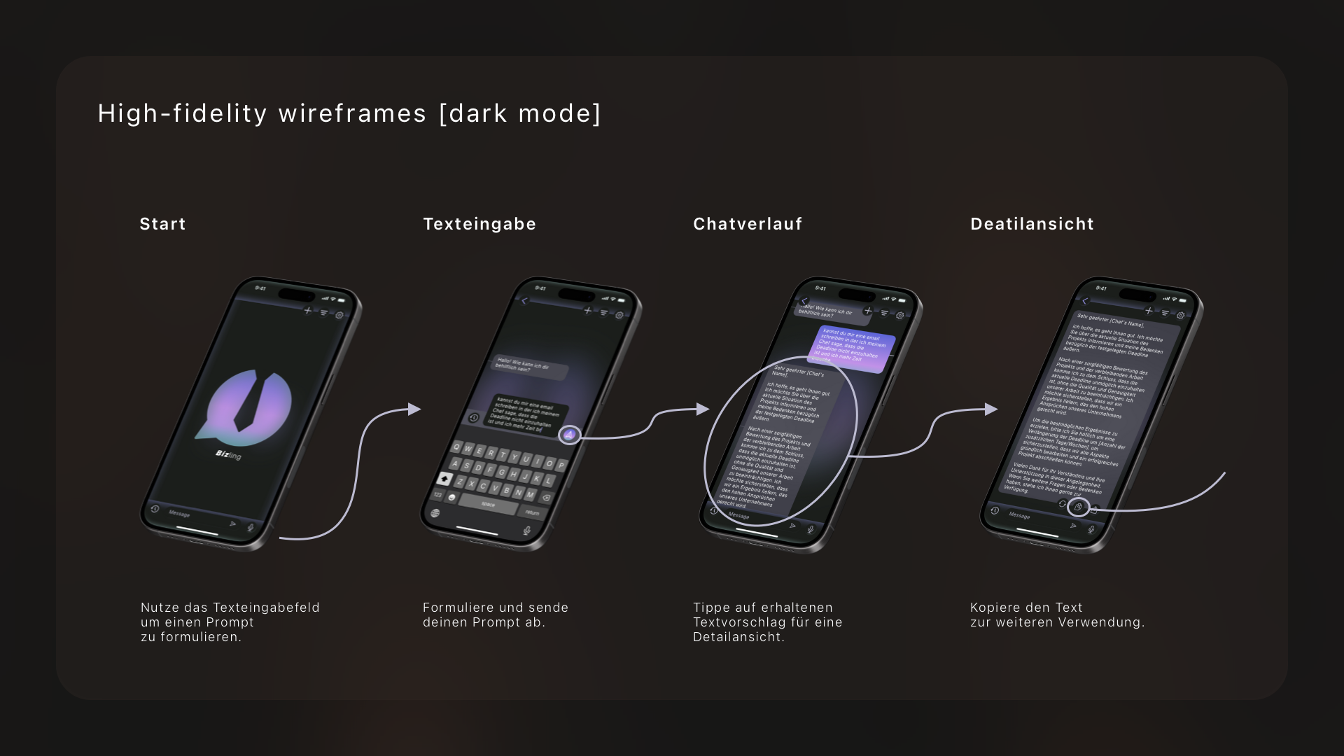
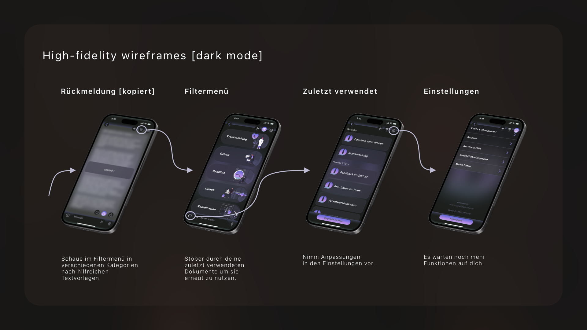
Dark mode design was a key consideration
in my development of Bizling.
I recognized the growing trend
and user preference for dark interfaces,
especially in professional settings
where users often work late hours.
Implementing a dark mode option
not only enhances the aesthetic appeal of the app
but also reduces eye strain and improves
readability in low-light environments.
My dark mode design incorporates subtle contrasts,
ensuring that text and elements
remain easily discernible while maintaining
a sleek and modern look.
By offering this feature, we're empowering users
to customize their experience
and cater to their individual preferences,
ultimately enhancing their overall satisfaction
with Bizling.
Prototyping
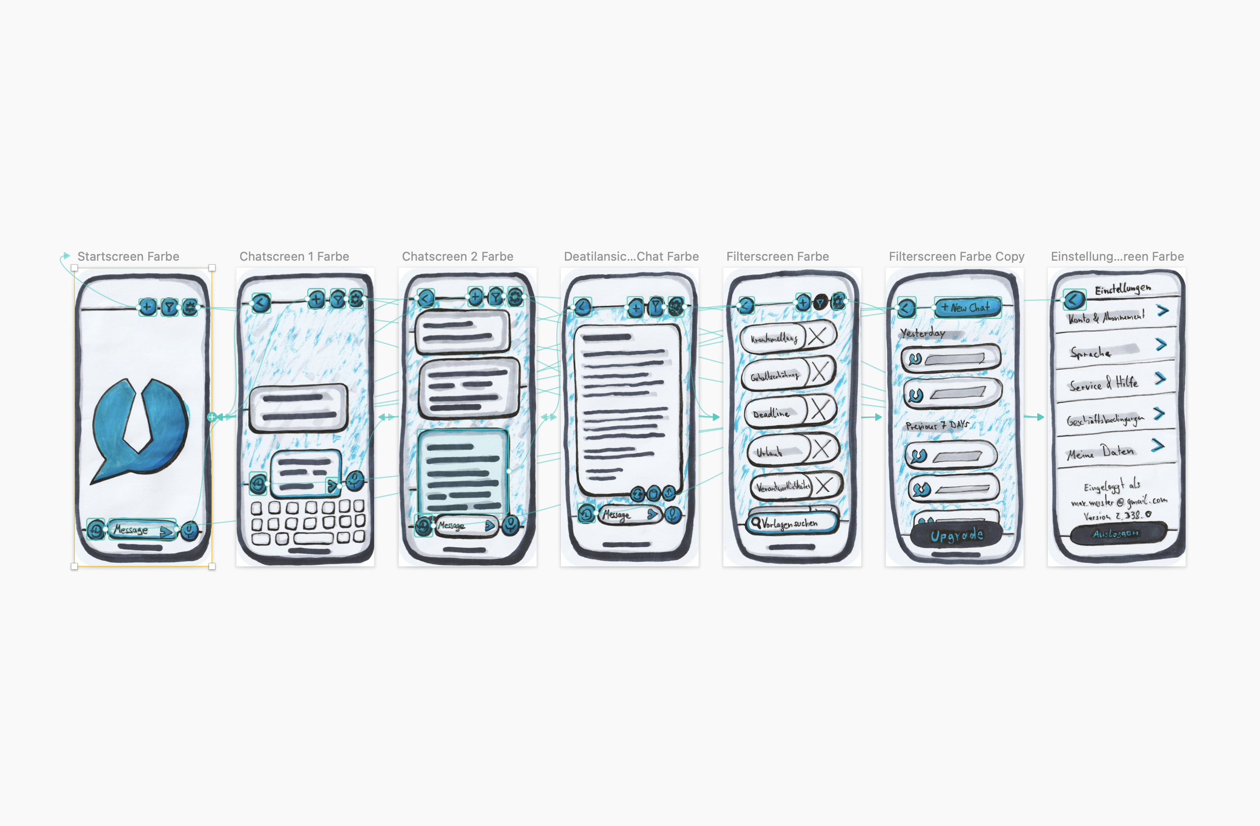
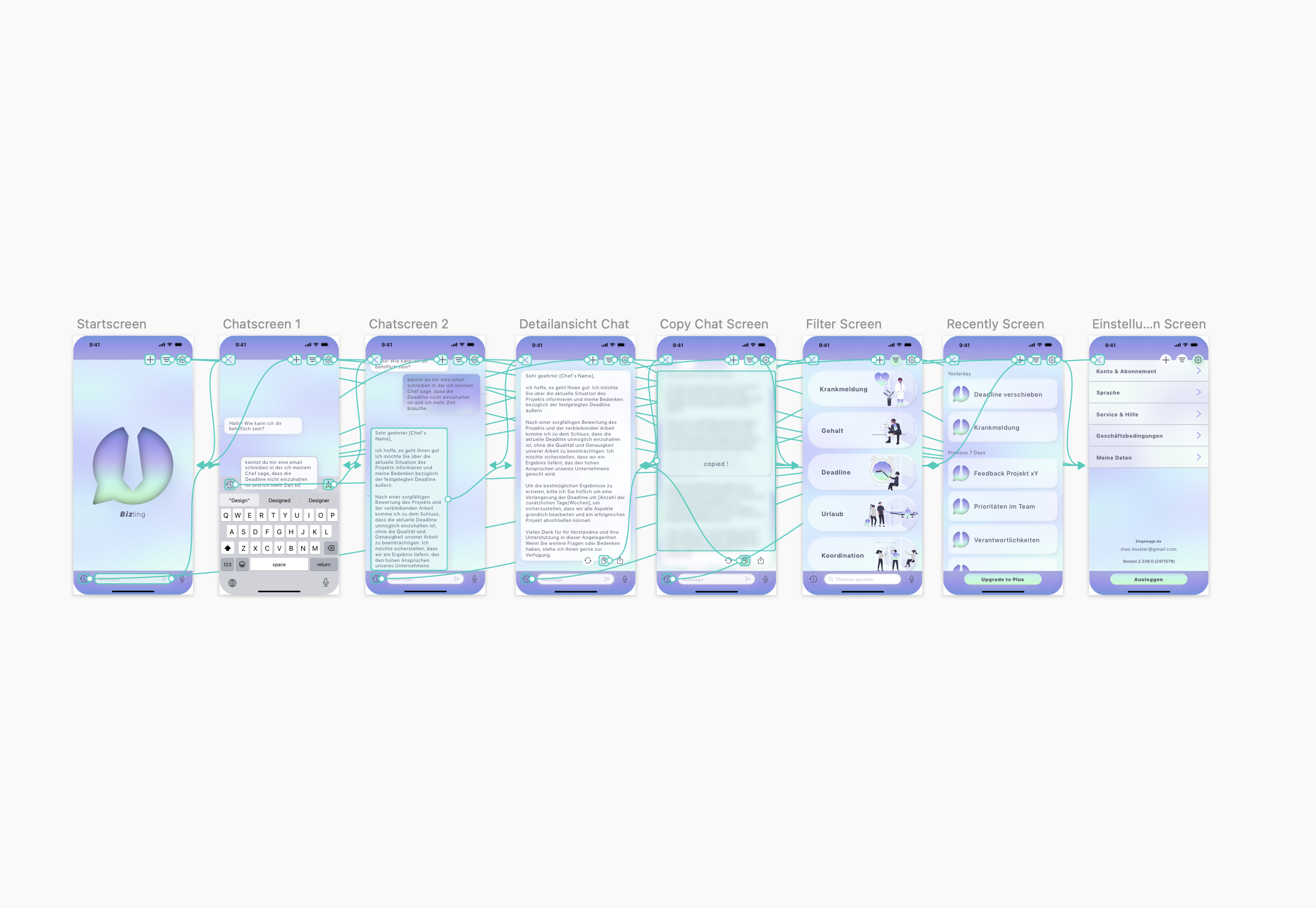
Prototyping was the secret sauce in bringing Bizling to life!
I didn't just dream up ideas; I put them to the test
with prototypes that let us see our designs in action.
From simple paper mockups to interactive digital prototypes,
I explored different functionalities and user flows,
refining my design with each iteration.
Prototyping wasn't just about making things look pretty;
it was about making sure they worked seamlessly for the users.
By getting hands-on early in the process,
I could identify and address potential issues
before they became big problems.
With prototyping as my compass,
I navigated the design journey with confidence,
knowing that every decision I made was backed
by real-world testing and user feedback.
Styleguide
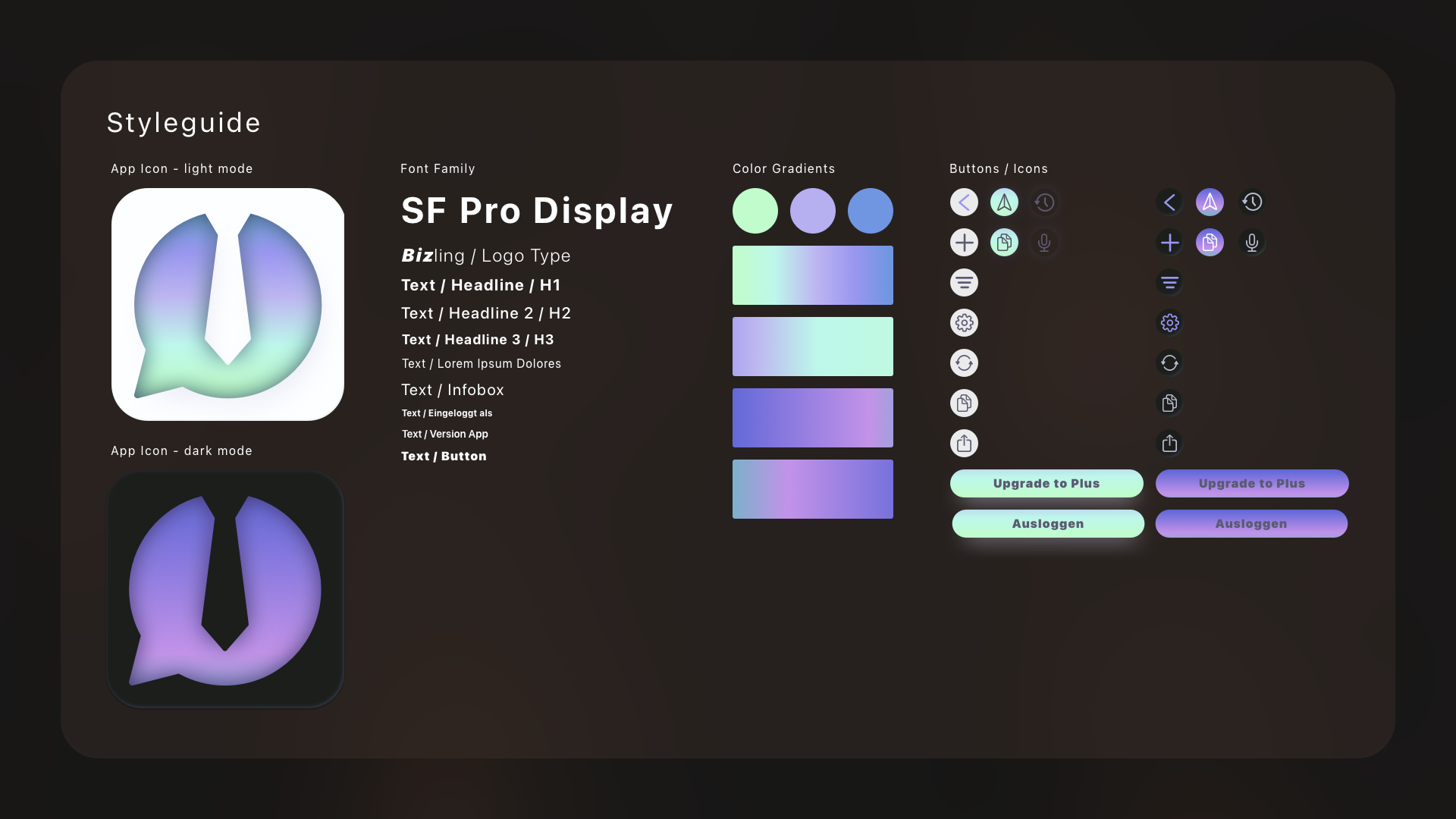
Crafting the style guide for Bizling
was a comprehensive yet engaging process.
It involved precisely defining the brand's
visual identity to resonate effectively
with our target audience.
Every aspect, from color palettes to typography choices,
was thoughtfully curated to embody professionalism and clarity.
With a focus on consistency and coherence,
the style guide serves as a roadmap for design teams,
ensuring that every facet of Bizling's interface
exudes reliability and sophistication.
It's not just about aesthetics;
it's about creating an immersive experience
that is easy to navigate and instills confidence to the user.
MitVergnügen App
Overview
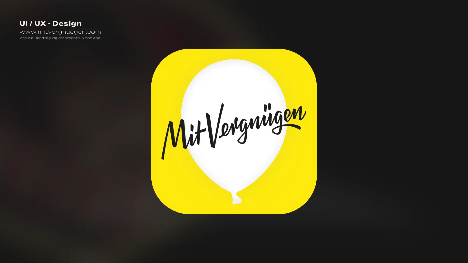
This project emerged within the context of my ongoing training in UI/UX design,
serving as an exercise to translate the design concept of the "Mit Vergnügen"
Berlin online city magazine website into a mobile app interface.
Leveraging my skills in Sketch, I crafted a mobile design that captures
the essence of the website while optimizing it for mobile interaction.
By curating iconography and imagery from the website,
I aimed to maintain brand consistency and enhance the user experience.
Objective
Through this project, my goal was to demonstrate my proficiency in UI/UX design
by adapting the design language of the "Mit Vergnügen" Berlin online city magazine
website
into a mobile app interface.
Utilizing Sketch, I aimed to showcase my ability
to seamlessly translate web design concepts to mobile platforms,
emphasizing user-centricity and brand consistency.
Please note that while this project is a conceptual exercise
undertaken during my training, it highlights my strategic approach
to UI/UX design and my commitment
to delivering engaging and intuitive user experiences.
Credits
In this project, I took responsibility for various aspects
including the app icon design, persona development,
empathy map creation, customer journey mapping,
task flow analysis, wireframing, and user interface design.
Utilizing Sketch as my primary tool,
I meticulously crafted each element
to ensure a cohesive and engaging user experience.
While this project remains a conceptual exercise
within the context of my UI/UX design training,
it reflects my dedication to mastering the craft
and delivering exceptional design solutions.
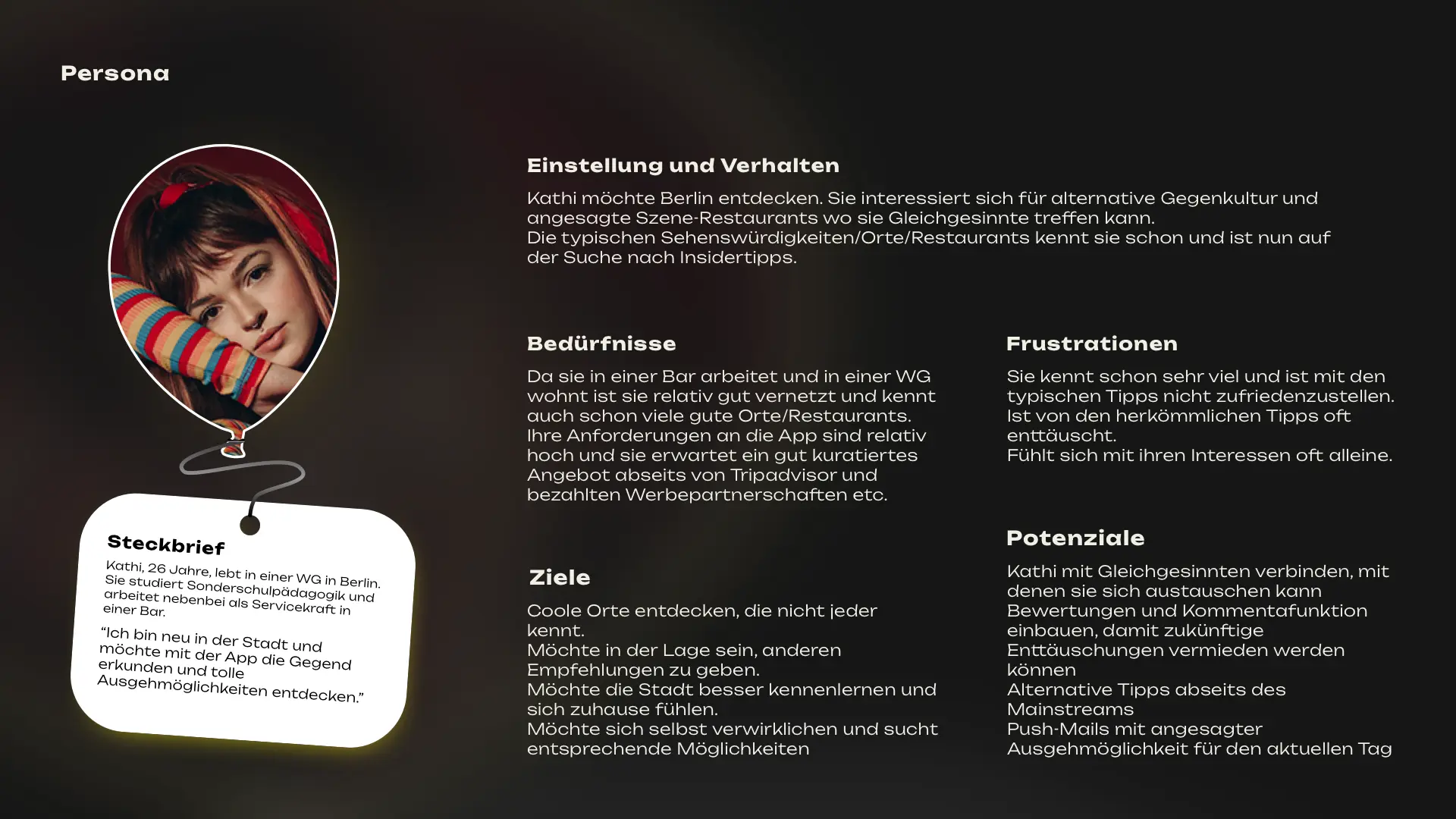
Personas

Crafting user personas played a pivotal role in this project,
allowing me to immerse myself in the mindset of potential users
and customize the app interface accordingly.
Through thorough research and analysis,
I developed personas that encapsulated
a spectrum of user demographics,
ensuring the app design resonated
with various preferences and behaviors.
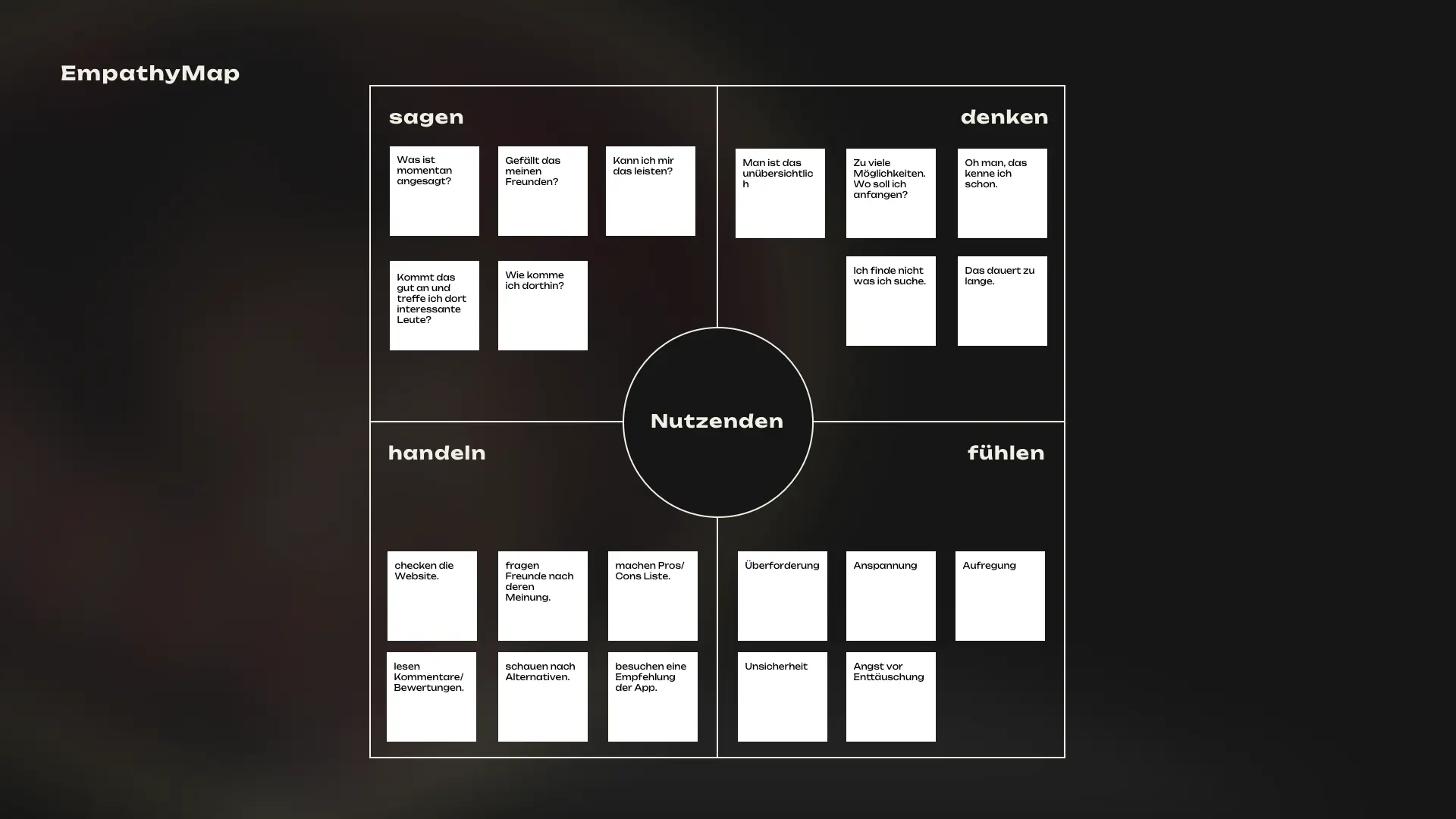
Empathy Map

Constructing empathy maps was instrumental
in gaining a deeper understanding of users' emotions,
motivations, and pain points throughout
their interaction with the app.
By visually mapping out their thoughts, feelings
and experiences, I was able to empathize with users
on a profound level, informing design decisions
aimed at enhancing their overall satisfaction and engagement.
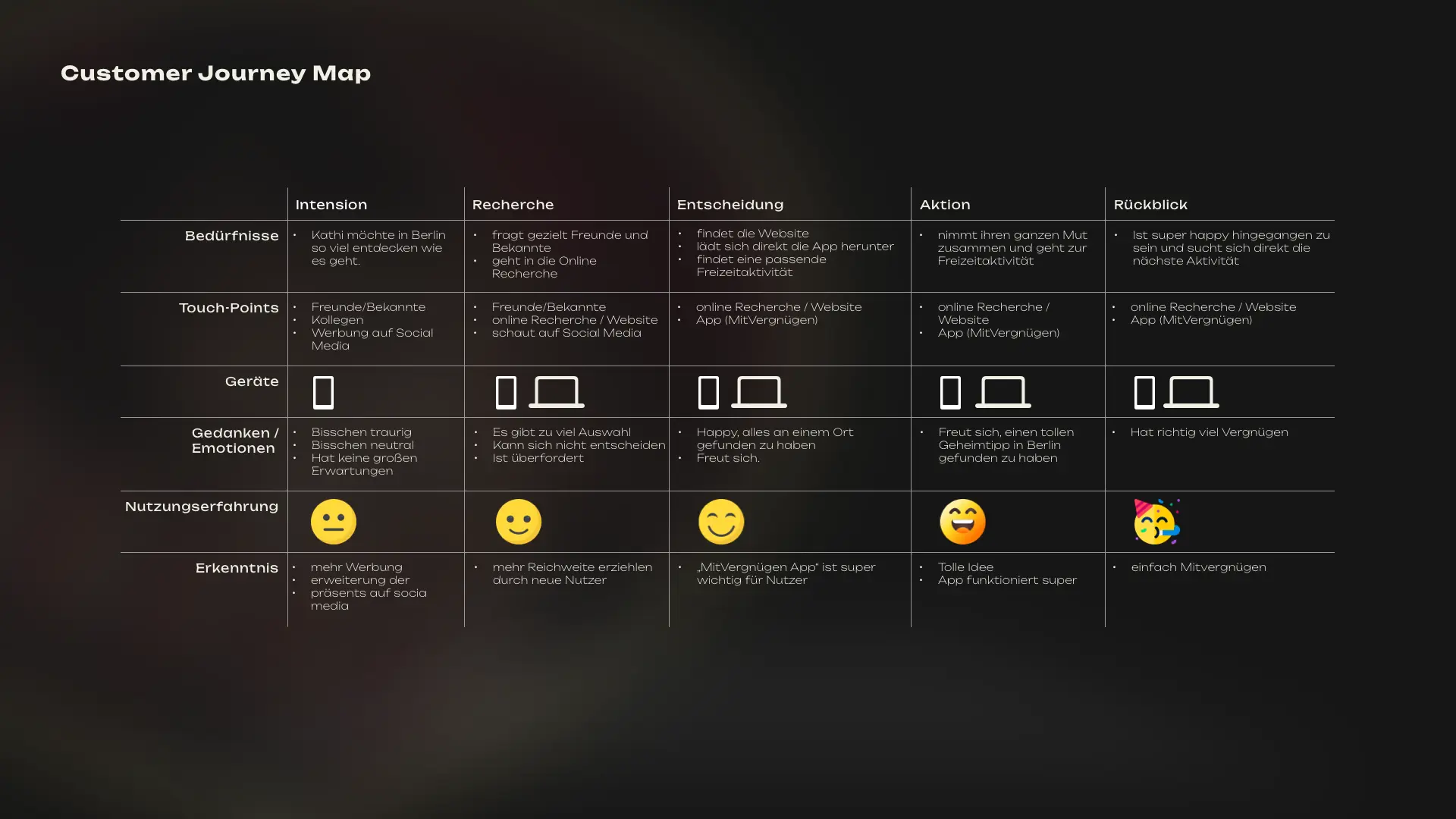
Customer Journey Map

Creating a customer journey map was essential
in visualizing the entire user experience,
from initial interaction with the app to achieving their goals.
This process allowed me to identify key touchpoints
and potential pain points along the user journey,
enabling me to optimize the app interface
for a seamless and satisfying user experience at every stage.
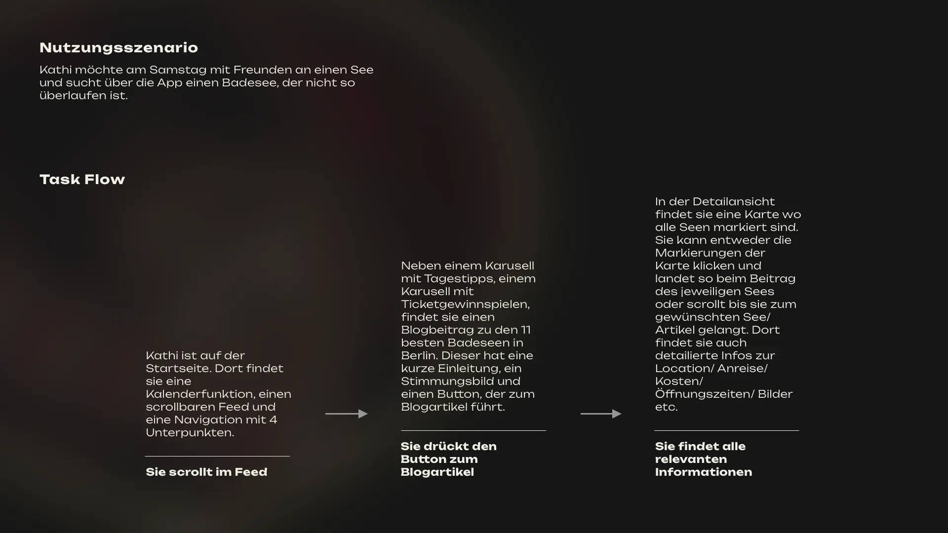
Usage Scenario and Task Flow

By crafting usage scenarios and task flows,
I honed in on typical application cases within the app
and refined the flow of user interactions.
Defining clear steps users take to accomplish their goals
ensured the app's ease of use and efficiency.
This approach allowed for targeted enhancements to the user experience,
aligning design with user needs and expectations.
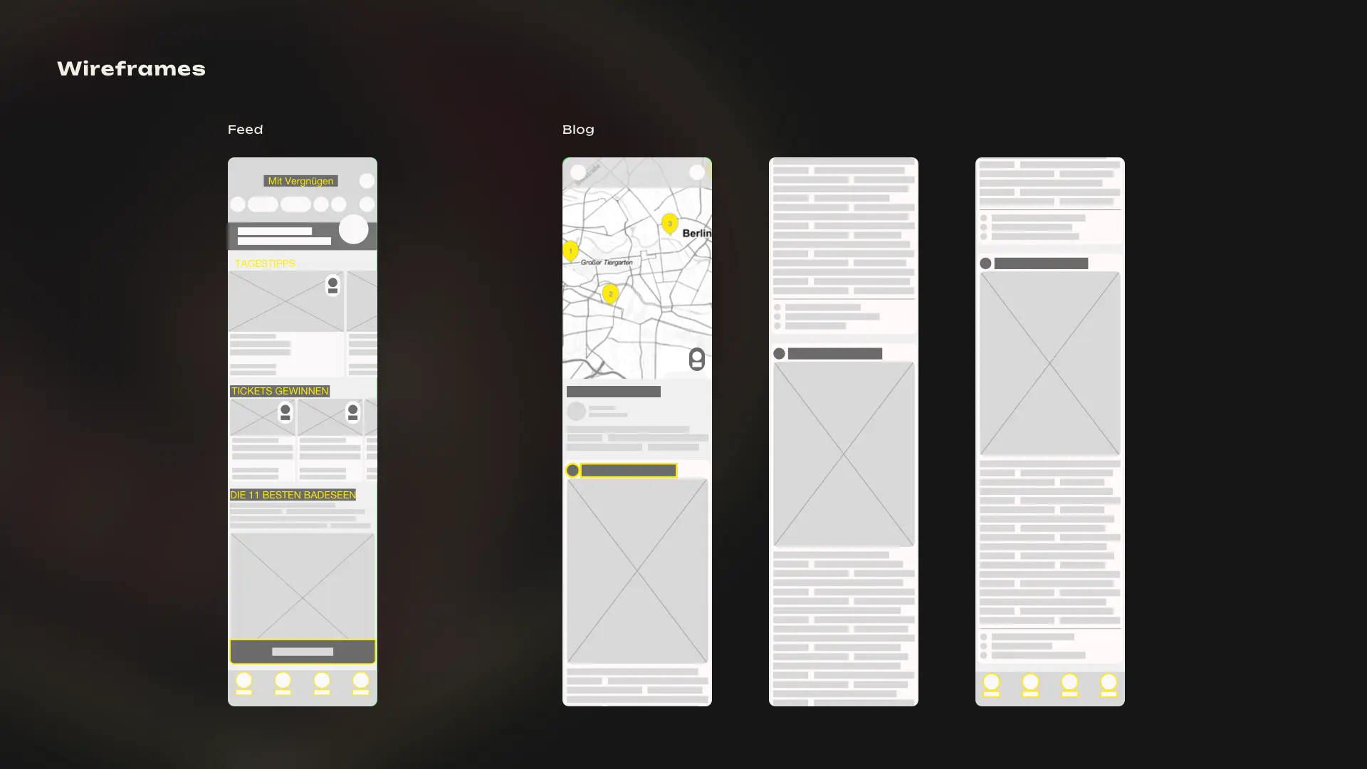
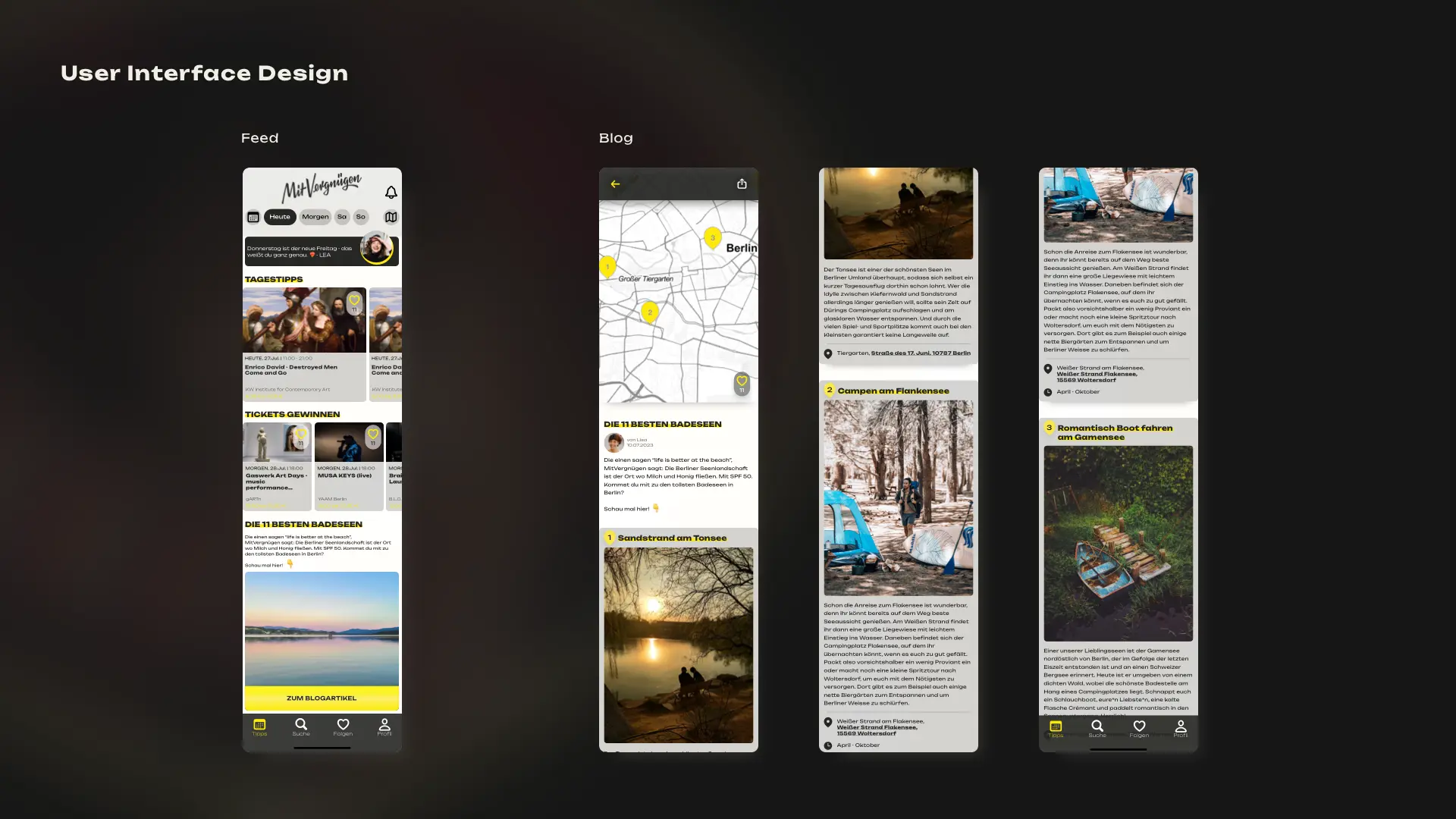
Low-Fidelity and User Interface Design


From low-fidelity wireframes,
which provided a rough blueprint of the app's layout and functionality,
to high-fidelity wireframes that detailed precise visual elements and interactions,
I navigated through various stages of design iteration.
Low-fidelity wireframes allowed for rapid prototyping
and early feedback gathering, while high-fidelity wireframes
polished the design to reflect the final product's look and feel.
This iterative process ensured a thorough exploration
of design possibilities and a refined user interface
that seamlessly guided users through the app's features.
Summary

In summary, the synthesis of user personas, empathy maps,
customer journey maps, and task flows informed the creation
of both low-fidelity and high-fidelity wireframes.
These wireframes, developed through iterative design processes,
ultimately converged into a coherent user interface design.
By aligning every design decision with user needs and expectations,
I ensured that the interface not only met functional requirements
but also provided an intuitive and engaging experience for users.
